Microsoft® Excel offers the Radar Chart. This chart does not use the typical X-axis versus Y-axis. Instead, the radar chart is a graphic display of multivariate data in the form of a two-dimensional chart.
Viewing the radar chart shows which observations are most similar as clusters of observations can be identified as well as are there any outliers.
To start, a comparison of a typical histogram chart displaying the constituents of the Dow Jones Industrial Average and their current readings of the relative strength index (RSI) study. You can scan along the chart looking for high and low readings and then down to the label axis for the names of the companies.

The chart below is a radar chart (with markers) of the same data. A difference from the standard radar chart is the data point values are not displayed next to the data points on the chart but for a cleaner look the values are included as part of the axis labels.
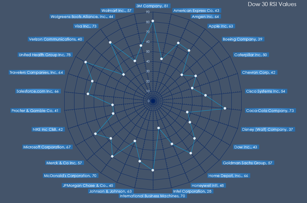
Easily seen are the high RSI readings (above 70): 3M 81, Coco-Cola 73, IBM 70, McDonald’s 70, United Health 78, and Visa 73. Low RSI readings (40 or lower): Boeing 39, Disney 37, Intel 28, and Verizon 40.
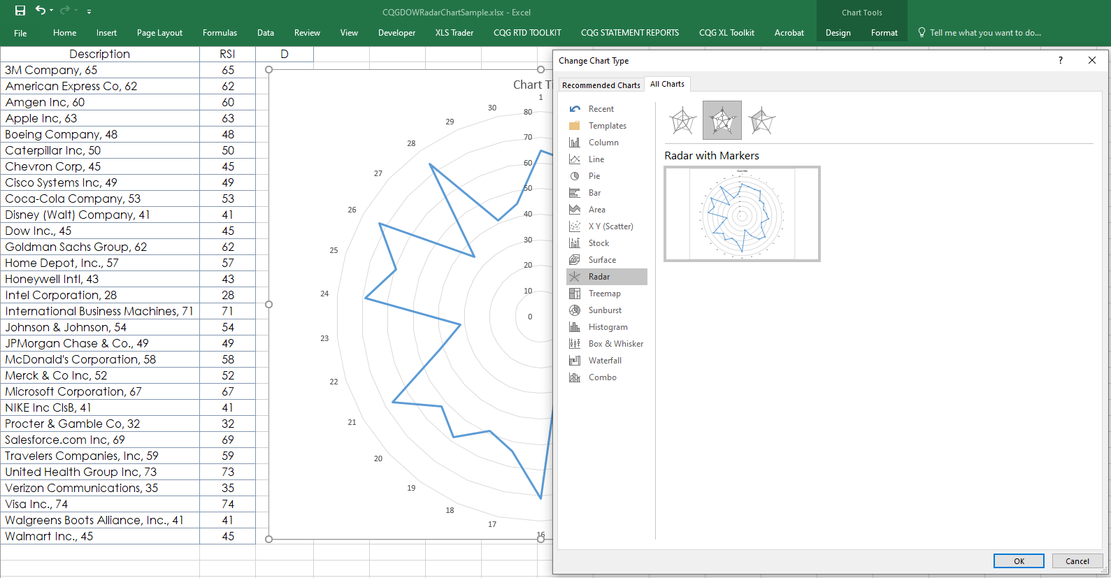
To add a radar chart to your Excel dashboard (a downloadable sample is provided) you select the column of the data you want to display and then choose Radar Chart.

The radar chart opens with the data, however, spokes do not appear on the chart. To add spokes, select the chart and change the chart type to Radar Chart with Markers. Click OK.
Then, change the chart type back to Radar Chart, click OK.
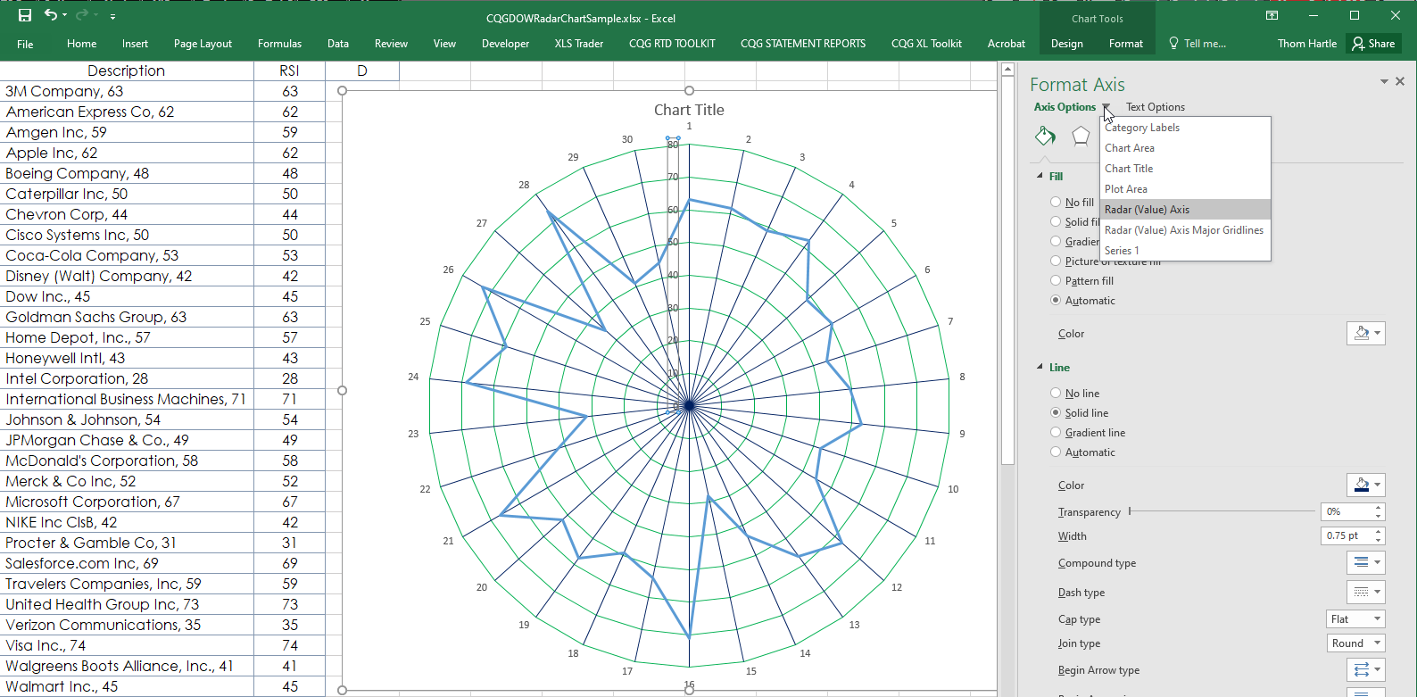
Right-click on any axis line and select Format Axis. Select Axis Options and then select Radar (Value) Axis. Under Line, choose Solid line and the color. Click OK.
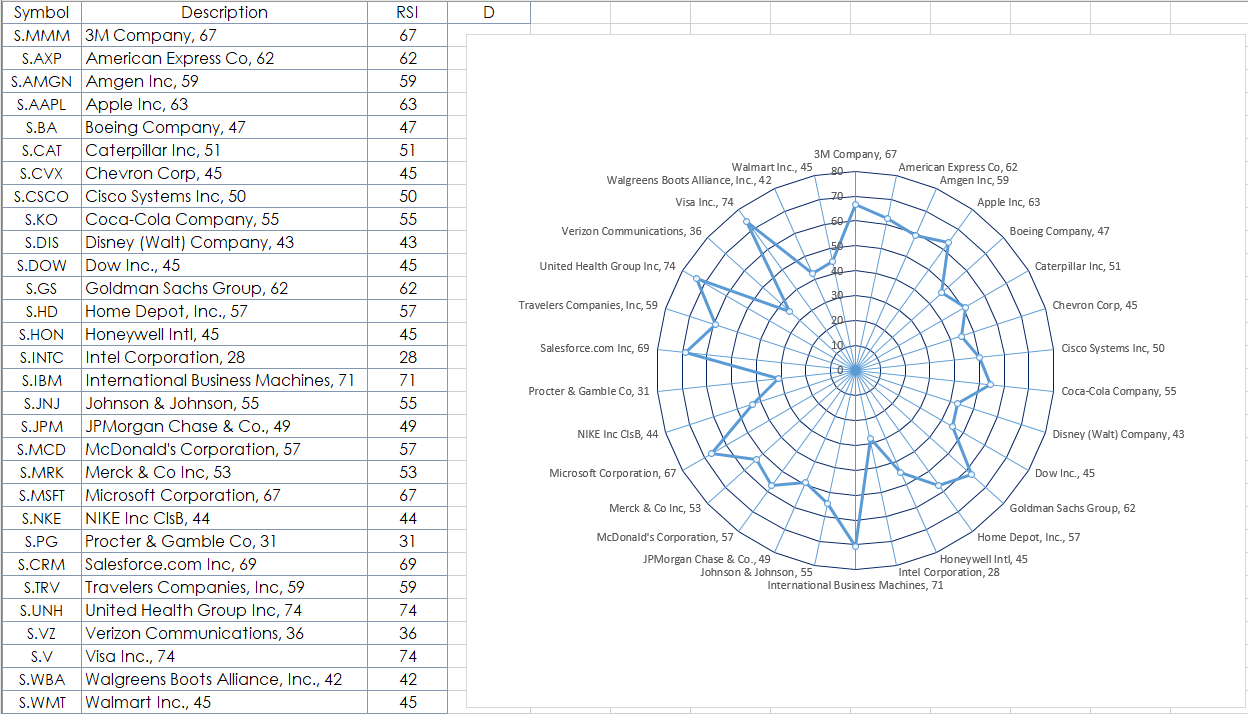
Next, add the labels around the outer circle. First, to avoid using labels on the end of the data points in the chart, which clutters the chart, the RTD formula for the “Long Description” is merged with the RSI values using this Excel formula:
=RTD("cqg.rtd", ,"ContractData",A2, "LongDescription",, "T")&", "&TEXT(C2,"#")Right-click the chart and choose Select Data. Then, Edit Horizontal (Category) Axis Labels. Select the cells with the data labels and hit OK.

You can modify the chart elements to include Markers and use different colors. Cell D1 is the Time Frame for the RSI.
Radar Charts give a unique view of the data and outliers are easily identified.
Requires CQG Integrated Client or QTrader. Strongly recommended: Microsoft Office Professional Excel 2016, 2019, 32 or 64-bits installed on your computer, not in the Cloud.