This Microsoft Excel® dashboard presents different styles of viewing market and study information. The left-hand side is today's current market data. You can enter symbols and set the number of decimals. The HiLoAlert cell is a user-entered value where if the Last price is within that amount of the high or the low, then the high price is highlighted red or the low price is highlighted green. For example, you enter 2 in the HiLoAlert cell and if the Last price is 98.50 with the current High being 100, then the Last is within 2 points of the High so the High price is colored red.
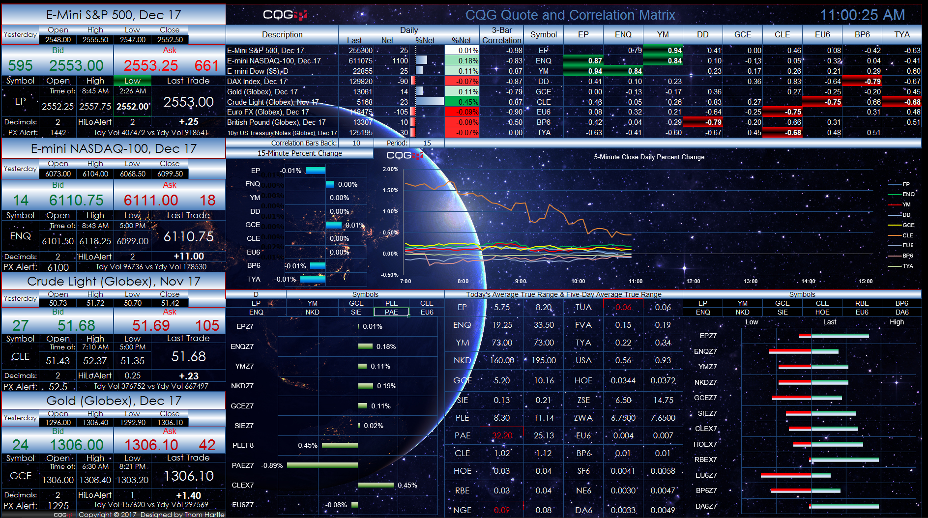
The Correlation Matrix allows you to enter symbols and set the correlation look-back and time frame. The top and bottom five correlated markets are heat-mapped. The two charts use the symbols from the center column in the Correlation Matrix.
The Relative Change section uses the symbols you enter. You can change the time frame for the percent-change histogram bars; here it is set to "D" for daily. The Average True Range (ATR) section compares today's ATR to the 5-day ATR. Markets that exceed the 5-day ATR are highlighted red. The display in the bottom right-hand corner indicates where the last price is relative to the range for the day.
Make sure to lower your Excel RealTimeData (RTD) throttle to 50 milliseconds. Learn how to do that here.
Requirements: CQG Integrated Client, data enablements for all symbols displayed in this spreadsheet, and Excel 2010 or more recent.