One of the questions that comes up every now and then is about measuring the performance between two markets. So far since January 2015, DAX and EURO STOXX futures have rallied very strong, but which one is stronger?
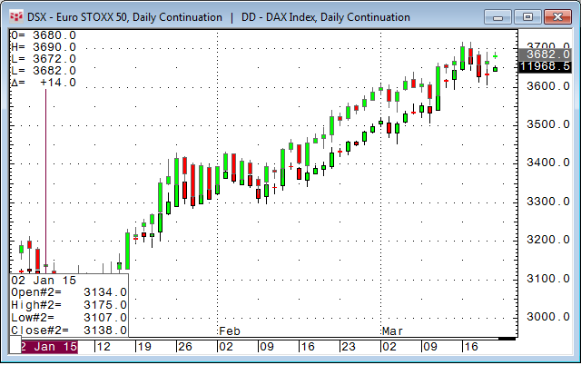
Unfortunately a simple chart analog overlay does not really help because the function just tries to capture both charts "graphically" in the same window.
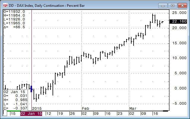
We should get a much clearer picture using percentage bars starting January 2015.
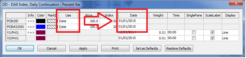
Percent Bar (PCB) definition from help.cqg.com:
Percent bar charts are displayed as percentages from a user-selected base price or from the close of a bar determined by the base index.
Base price is defined as the price from which all other values have their percentages derived.
Base index is an offset number of bars from the current bar. The close of the base index bar is used as the price from which all other values have their percentages derived, if Index is select as the Use parameter.
If the base price indicates a price (i.e. not 0), the "0% point" is located at the specified base price and the base index value is ignored. all other percentages are derived from this 0% point.
If the base price equals 0, the close of the base index bar is used as the 0% point.
If Use is set to Date, the 0% point is set to the close value for the date entered.
We have used this option for the chart.
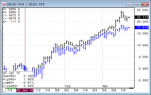
Now we can say that DAX is up 22.135% and EURO STOXX is up 17.679%, so the DAX performed 4.5% better than the EURO STOXX. To have a graphical representation, we can also use chart analog overlay to overlay two percent bars in one chart. Make sure to use the same parameters.
As the next step, we can build a simple study that measures the difference between both percentage values.
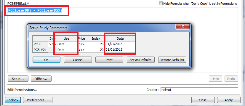
Make sure you force both PCClose manually to the markets you want to compare. Here is DD - DSX:
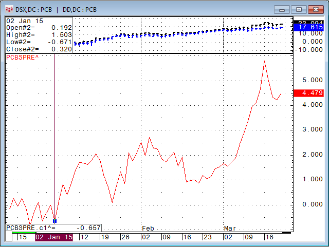
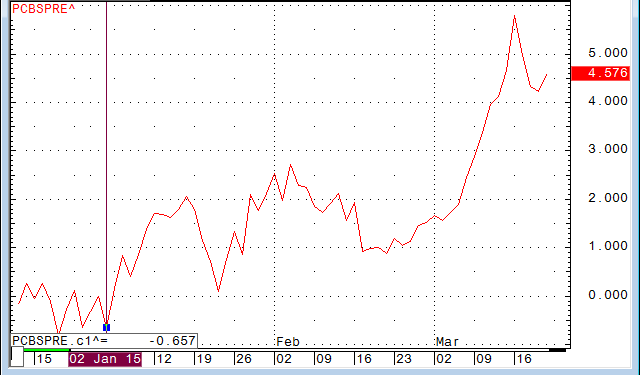
Below is the custom study subtracting one percent value from the other. If the number is positive, it means the first contract is outperforming the second.
If you need a graphical representation of this but you do NOT care about the exact numbers on the scale, there is a very simple shortcut for this.
I call this the Baseball Chart. Why? In US sports such as baseball, percentages are often represented in a decimal number such as .3664 instead of 36.64%. You get to this very simply: divide the hits by the number of attempts. For example: 132 hits / 396 attempts = .3333.
Let's try this in our chart window: DD/DSX
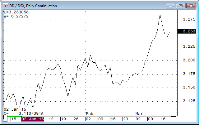
Look familiar?
This is a very quick shortcut. If the chart is up, it means the first contract outperforms the second.