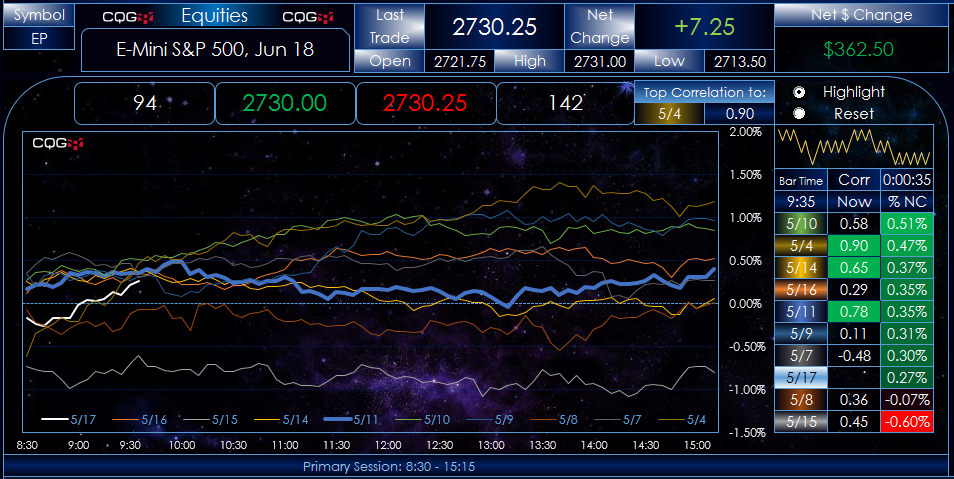
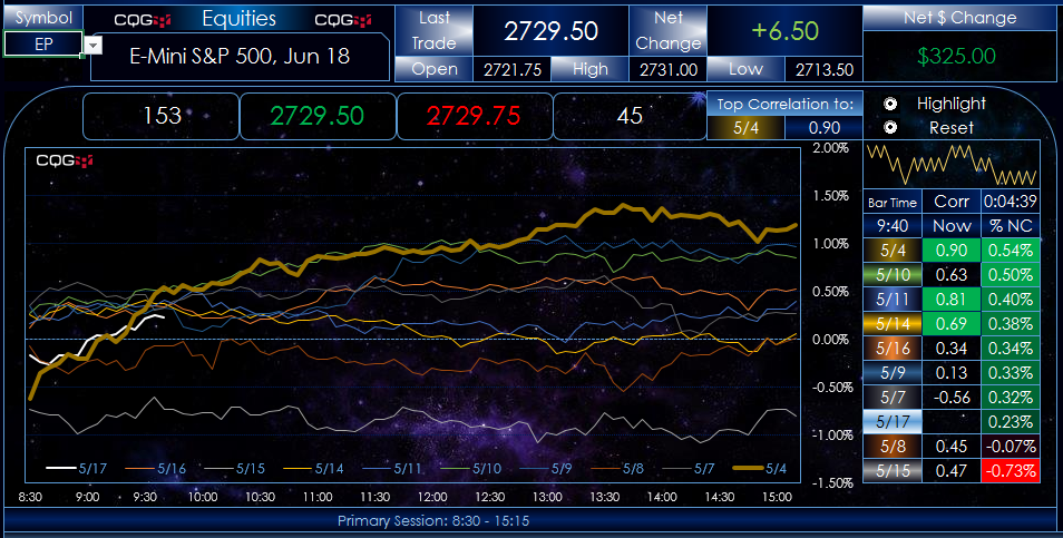
This is an updated post detailing new features in the original dashboards from a previous post. The three downloadable Microsoft Excel® dashboards present a unique view of four markets. Each overlay chart displays 5-minute percent net change lines from the previous day’s close for today and the previous nine days. Today’s price action is a white line, updated in real-time throughout the day. The other nine lines represent the individual 5-minute percent net change price action for each day by date. The legend displayed just above the time axis shows the color of the lines and the respective dates.
What each chart provides is a frame of reference - now you can compare today’s market action to the previous nine days of market action. You may notice a market may have a tendency to trend higher throughout the trading day if it opens higher, or more selling may tend to follow a weak opening.
A table accompanies each chart, sorted and ranked by the percent net change. The table displays the time of the current 5-minute bar and the current correlation for each previous day’s trading to today’s price action at this time.
The correlation is anchored to the start of the session and updates as today’s trading action unfolds. There is a display section titled “Top Correlation To:” and it shows the date the current market action has the highest correlation to and the current correlation value.
What is New
New in these dashboards, next to the highest correlation date and value, is a radio button. Select the radio button “Highlight” and highlight that day’s line.
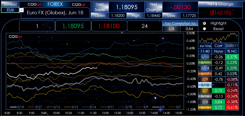
Notice that the legend highlights the date’s line (5/8).
Correlation can, and often will, change throughout the trading session. Excel is not set to automatically update the current date’s line with the highest correlation: this is a step you will do.
Figure 2 shows that the top correlation is currently 5/4. Earlier, the top correlation was 5/11, which you see highlighted in the legend.
Since the top correlation has changed, you click “Reset” to clear the highlighted line and then “Highlight” to use 5/4 as shown in Figure 3.
There are two CME Globex dashboards. They have a dropdown menu for each symbol group. Due to the different length of sessions, the Excel charts have to be hard-coded for the session.
The Equities dashboard allows you to enter in a stock symbol. All four Equity charts use the same session.
If you use the Eurex Dashboard, CQG and your computer must use the same time zones.
Excel charts can use a lot of resources, which is why Windows 10 is recommended over Windows 7.
Requires CQG Integrated Client or CQG QTrader, data enablements for all symbols used in the spreadsheet, and Excel 2010 or higher.