This Microsoft Excel® dashboard presents two charts of the Nasdaq-100 futures contract and market data for the one hundred stocks that are constituents of the Nasdaq 100 Index.
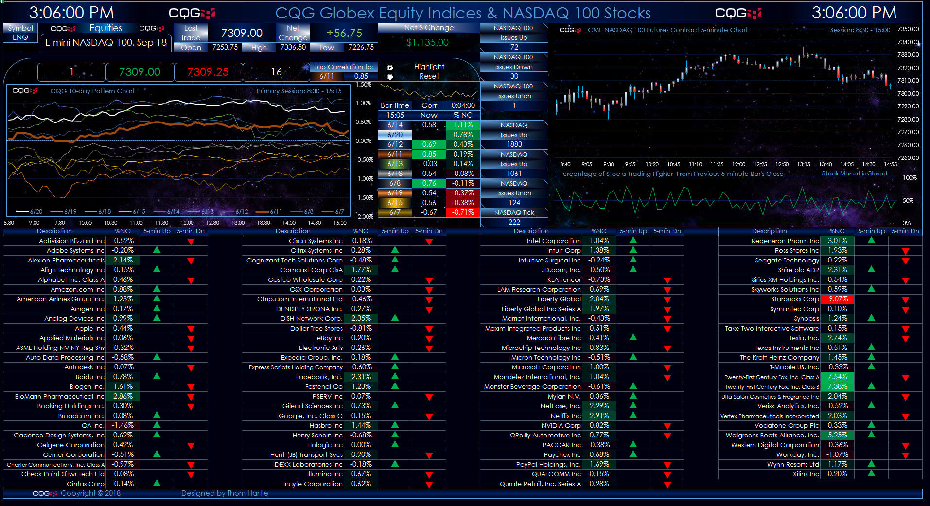
The chart in the top left corner displays the 10-day Map Chart of the E-mini Nasdaq 100 Index contract. The chart on the right is a 5-minute candlestick chart with a diffusion index study presented at the bottom of the chart. The table is the current members of the NASDAQ 100 Index with the day’s percent net change. The net change columns are heat-mapped. The next two columns indicate whether the current 5-minute bar is up or down from the close of the previous 5-minute bar. Up is indicated by a green arrow, and down is indicated by a red arrow.
The 10-day Map Chart of the E-mini NASDAQ 100 Index contract is an overlay chart displaying 5-minute percent net change lines from the previous day’s close for today and the previous individual nine days' data. Today’s price action is a white line, updated in real-time throughout the day. The other nine lines represent the individual 5-minute percent net change price action for each day by date. The legend displayed just above the time axis shows the color of the lines and the respective dates.
This chart provides a frame of reference - now you can compare today’s market action to the previous nine days of market action. You may notice a market may have a tendency to trend higher throughout the trading day if it opens higher or more selling may tend to follow a weak opening.
A table accompanies each chart, sorted and ranked by the percent net change. The table displays the time of the current 5-minute bar and the current correlation for each previous day’s trading to today’s price action at this time. The correlation analysis is anchored to the start of the session and updates as today’s trading action unfolds. There is a display section titled “Top Correlation To:” and it shows the date the current market action has the highest correlation to and the current correlation value. Next to the highest correlation date and value is a radio button. Select the radio button “Highlight” and highlight that day’s line. Select “Reset” to clear the highlighting.
Correlation can, and often will, change throughout the trading session. Excel is not set to automatically update the current date’s colored line in the chart with the highest correlation: this is a step you will do. You can easily tell which date line is highlighted by checking the date legend just above the time axis. The date legend includes a thin colored line. One line will be thicker than the rest. This is the line and date that is highlighted in the chart. If that date does not match the top correlation date, then click “Reset” and then “Highlight.”
Below the 5-minute candlestick chart is a study. This is a diffusion index. It shows, on a 5-minute basis, the percentage of stocks that are trading higher from the previous 5-minute bar’s close. The same information on a stock-by-stock basis is presented in the table. A green arrow indicates the stock is higher than the previous 5-minute bar’s close and a red arrow indicates the stock is trading below the previous 5-minute bar’s close.
Excel charts can use a lot of resources, which is why Windows 10 over Windows 7 is recommended.
The dashboard requires a session PAC for the E-mini Nasdaq 100 chart.
Requires CQG Integrated Client, data enablements for all symbols used in the spreadsheet, and Excel 2010 or higher.