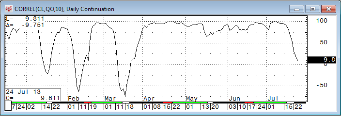
The Correlation function in the CQG toolbox correlates the price movement of two symbols over a defined number of bars. For example, CORREL(CL,QO,10) will return the correlation between West Texas Crude on the NYMEX and North Sea Brent on the ICE over the last ten bars on the chart. Another variation on the correlation study is the following: CORREL(@,SP,10), which correlates any symbol on the chart with the S&P Index over the last ten bars.
If we want to investigate the correlation between multiple assets, we can create a custom study with multiple lines. For this example we want to use DA6, NE6, CA6, and the NK6 future. The code Correlation(DA6,@,10) will correlate DA6 against whatever is used in the chart. The second curve uses the same code with NE6 substituted for DA6 and so on. Every curve gets a corresponding name and color assigned.
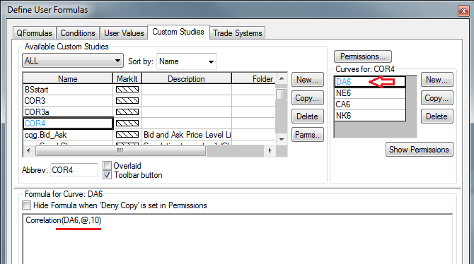
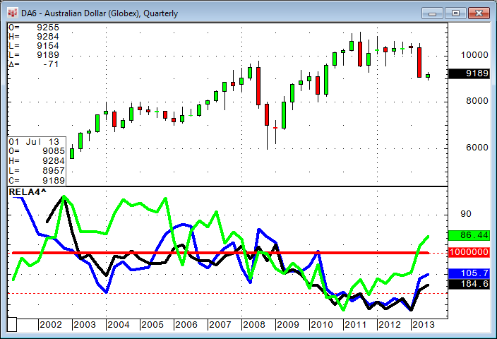
We can call up the Australian Dollar on the chart, for example, and see immediately how the other three assets correlate (or do not) with this contract.

.
Relative Performance: An Alternative to Correlation
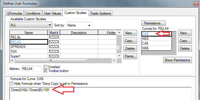
To begin, we use a DA6 chart again and create a custom study that looks at a percent close of the chart itself based on January 1, 2010 and the same for the NE6.

Plotting this on a chart, we can see in the top study (PCT^) that DA6 is up 3.098% (red line) and NE6 is up 10.402% (green line). If we subtract the two studies from each other (i.e. 3.098% - 10.402%), we can see in the second study (PCTP^) that DA6 is performing -7.304% "worse" than NE6, and the line is a decline recently from a point where DA6 was performing better (up to +10%) than NE6.

If we don't need the "absolute numbers" of the percentage performance and instead want to know only the direction this line is taking, there is a very interesting shortcut. Simply divide DA6 by NE6 and you get the same line shape. Just ignore the numbers.

In this case, the performance of DA6 over NE6 is decreasing.
With this shortcut in mind, we can create one study that tells us the relative performance of four or more assets against whatever is on the chart, just like we did with the correlation.
, of course stays flat again.
Bonus: Market Data in a Custom Study
Now, as a little side effect, we have learned how we can substitute the @ sign in any formula with a particular symbol. Here is a little bonus example of what else can be done with @ in CQG formulas. @ stands for "the market" that is displayed on a chart, but it also understands the question mark syntax we can use with symbols. ZCE?1 gives us the first month and ZCE?2 gives us the second month. This also works with @?2. The formula Close(@) - Close(@?2) would give you the spread of the market displayed on a chart against the second contract. This way we can create a study that automatically gives you the first, second, third, and fourth calendar spread as a study on the market that is on the chart.
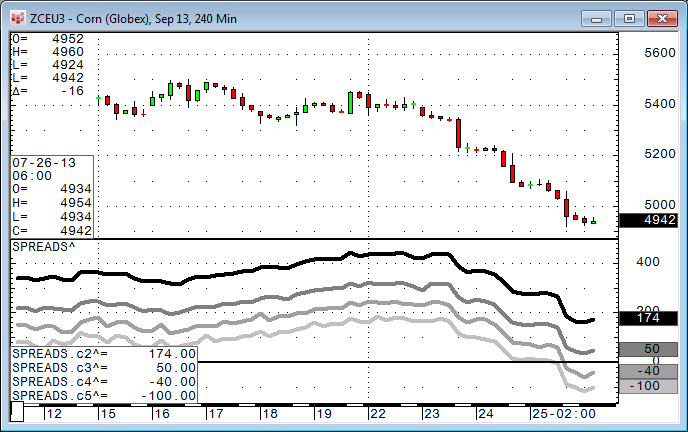
c2 is the current contract against second, c3 is the current contract against third, and so on. Interestingly, some markets seem to be very smooth "in line" where other markets are not.
The PAC contains the COR4, RELA4, and SPREADS studies. I have also included PCT, PCTP, and PCTC for re-engineering purposes.