CQG provides the ability to separate volume into trades executed at the best bid price and trades executed at the best ask price. This feature gives you more insight into market action because you can see whether sellers are aggressive or buyers are aggressive.
The breakdown of volume information into buyers and sellers is the basis for a pair of custom study oscillators called the Bid/Ask Volume Cross (BAVolCr) and the Bid/Ask Volume Cross Oscillator (BAVolCrOsc). For customers using CQG Integrated Client, the two oscillators are found on the Custom Studies tab under the Studies group. For customers using CQG QTrader, you can download the CQG pac at the bottom of this article and install the two oscillators.
These two oscillators can be used with most intraday chart types, including CQG’s exclusive TFlow charts. The Bid/Ask Volume Cross study displays two lines. The green line is a five-bar running sum of the ask volume, which represent buying. The red line is a five-bar running sum of the bid volume, which represent selling. The Bid/Ask Volume Cross Oscillator is simply the difference between the green and red lines. The oscillators lend themselves to a more classic approach to market analysis that includes both price action analysis and volume analysis.
For example, a double-top in a market may occur when the first top forms accompanied by a surge in volume as buyers aggressively push the market higher. A retracement of the rally occurs, which reverses and buyers take charge again pushing prices to test the price level of the first top. However, if this second rally has much lower volume than the previous rally, then the low volume is indicating less buyers are joining the second rally. This lack of participation by buyers may indicate that the market is vulnerable to trending down as previous buyers now become sellers as they elect to take profits.
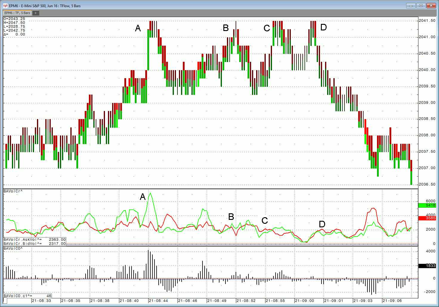
The example shown in Figure 1 utilizes CQG’s exclusive TFlow bars set to aggregating five individual TFlow bars and the Bid/Ask Volume Cross study. In this example the buyers pushed the market to the 2041.50 level four times (points A, B, C, and D). Each drive up represents traders buying, as indicated by the green line in the oscillator, which made a series of lower peaks. Buyers' aggressiveness was waning and the market trended down.
Figure 1
Another use of the oscillator is to spot possible short-term trend reversals by trending prices with the oscillator indicating traders are backing away. In Figure 2, the market is trending down, making a series of lower lows (points A, B, and C). The oscillator is confirming aggressive selling by the red line in the oscillator, which is higher than the green line during the price decline. However, with each new low, the red line is making lower peaks. The lower prices are not attracting more selling volume as indicated by the red line’s lower peaks and a short-term rally ensued.
Figure 2
Careful analysis of these studies can lead to good insight into what traders are doing because the studies break the volume down into action by buyers and action by sellers. This is a real advantage over typical volume studies that only show volume without this breakdown of buyers and sellers.

