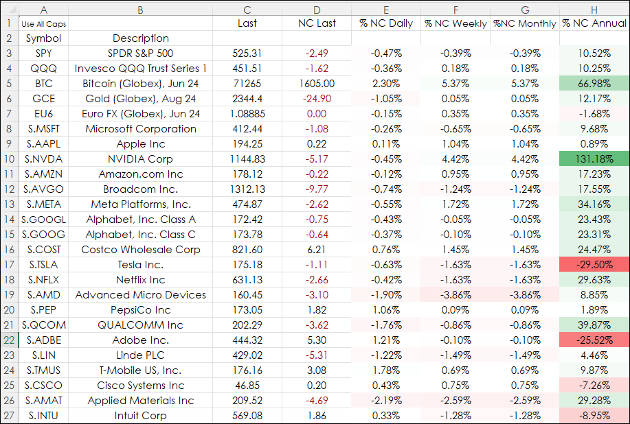
Heat mapping is a data visualization technique that highlights market performance using colors. Typically, bright green for the top performers and bright red for the weakest performers and gradient colors between the two.
The image below has columns for % Net Change Daily, % Net Change Weekly, % Net Change Monthly, and % Net Change Annually. If the entire selection has conditional formatting (heatmapping) applied then the % NC Annual will dominate the entire group.
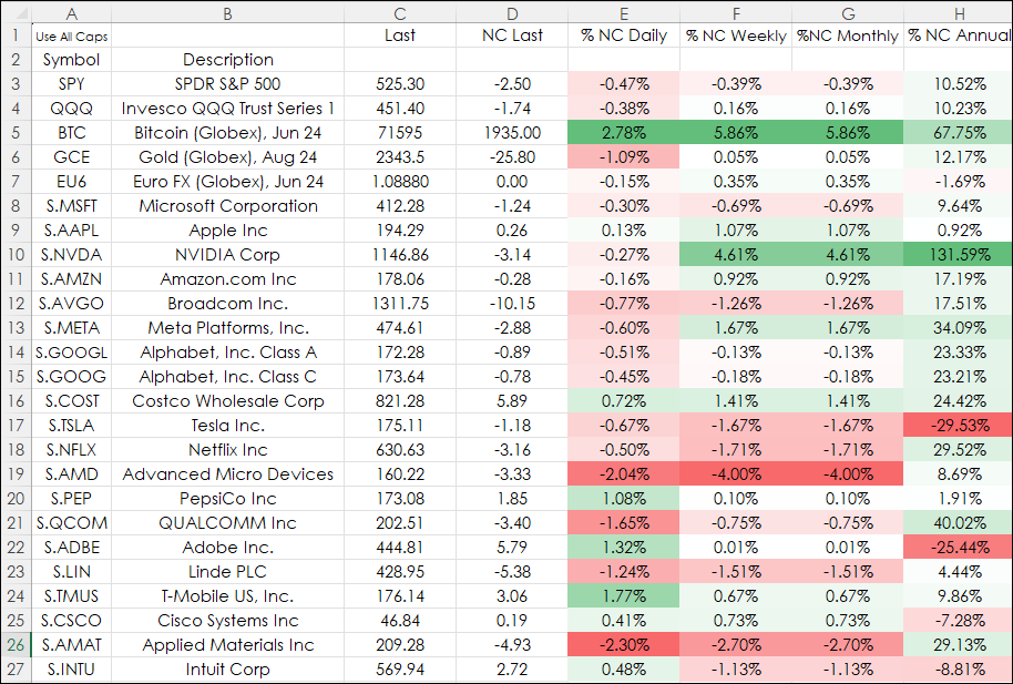
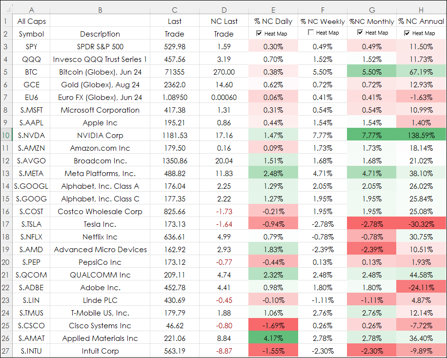
The image below displays the same conditional formatting applied except it is by individual columns. This is an improvement as the heat mapping is localized to the individual column.
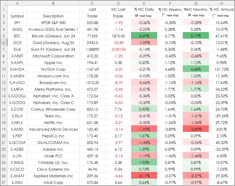
The best solution is to use Excel Check Boxes and the heat mapping can be toggled on or off for each column (the topic of this post).
A check box in Excel requires the Excel file to be saved as a Macro-Enabled file. Currently, Excel 365 has a check box functionality that is in Beta testing. Once that feature is released then the Macro-Enabled file will no longer be required.
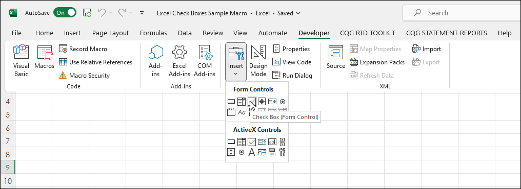
The first step is to add a check box. Go to developers/Insert/Form Controls/Check Box.
In the sample spreadsheet provided at the bottom of the post the first "Check Box" was placed in Cell E2. The name was changed to Heat Map. Right-click the Check Box and choose "Control." Enter cell "E2" for the Cell Link and use 3-D shading is checked then click OK.
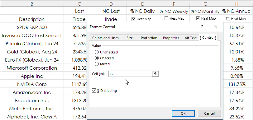
The Check Box is sitting over cell E2 and is linked to cell E2.
If the Check Box is checked on then TRUE appears in cell E2. If the Check Box is unchecked then FALSE appears in cell E2. The font color for the cell should be changed to white as it will appear behind the Check Box. Changing the font to white makes the TRUE or FALSE disappear.
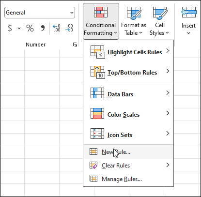
Next is setting the conditional formatting based on the TRUE/FALSE setting from the Check Box.
First, select the cells to be heatmapped. Then on the Excel Ribbon navigate to the Conditional Formatting feature: Home/Conditional Formatting/New Rule.
As shown in the image below:
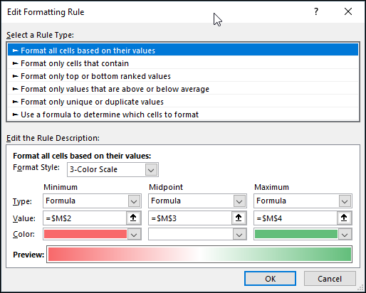
- Select "Format all cells based on their values".
- Select "3-Color Scale" for Format Style.
- Select "Formula" type for Minimum, Midpoint, and Maximum.
- For Value you can enter a formula or, as in this case, enter a cell reference.
- Choose the colors.
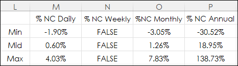
The cells have these formulas for heatmapping the Daily % Net Change column for cells $E$3:$E$27:
$M$2: =IF($E$2=TRUE, MIN($E$3:$E$27), FALSE)
$M$3: =IF($E$2=TRUE, AVERAGE($E$3:$E$27), FALSE)
$M$4: =IF($E$2=TRUE, MAX($E$3:$E$27), FALSE)
The downloadable Excel sample repeats this process for all four % Net Change columns.
The symbols used in the downloadable Excel sample can be changed, however the price formatting for decimals will need to be modified.
The sample Excel file type is macro-enabled.
Requires CQG Integrated Client or CQG QTrader, and Excel 2010 or higher. Excel has to be installed on the local computer, not in the cloud.