CQG's new Net Change chart offers analysis of daily volatility. With the chart, you can:
- Combine multiple Net Change charts using Chart Analog Overlay to visualize movement
- Change the price scale settings to the same scale for a comparison of like contracts
- Adjust the color for each instrument for better visualization
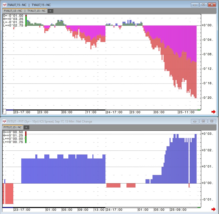
Example: This chart shows how Net Change can be used to analyze one Treasury contract out-pacing another. This type of net change analysis may provide insight into buying or selling opportunities. In this example, there is a clear sell-off occurring in Treasury futures and the movement in the underlying instruments correlates with the Net Change chart of the FYT (ratio spread) moving higher.