Imagine that today the 20 day correlation between the E-mini S&P 500 futures contract (symbol: EP) and the Crude Oil Contract (symbol: CLE) is 0.82. Now, is that a typical value or an unusual value? To gauge the reading you would look at a chart with the correlation study displayed and visually gain a sense of the current reading relative to the historical values. However, using Excel you can go one better and determine both where is the current value relative to the history and how many times the current value has occurred in the past using frequency distribution analysis, the topic of this post.
Frequency distribution analysis reviews the current and historical data and determines the number of times a value occurs in a range of values. The range of values is referred to as “bins.” For example, correlation has a range of 1.00 to -1.00. In the downloadable sample, the bins column has a high of 1.00 and a low of -1.00 and steps in 0.02 values (i.e., 1.00, 0.98, 0.96, etc.). Note: the Excel sample has two tabs, one is for daily bars analysis and one is for intraday bars analysis. We can only pull in 300 daily bars data and we can pull in 3,000 intraday bars.
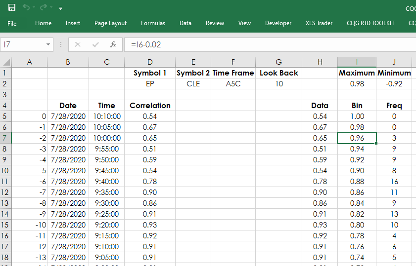
You can see in the image above you can enter in two symbols and set the correlation lookback period. For the frequency distribution counting, we use the Excel “COUNTIFS” function. This function allows for counting multiple events.
For example, this long hand version of the formula is how many times in the historical data was there a reading that was equal or greater than 0.92 but less than 0.94.
COUNTIFS(Data Range,>=0.92,Data Range,0.94)
Once we have the frequency count, an additional feature would be to rank the counts and then have a table displaying the top ten correlation counts. There is another post that details using the Rank and VLookup functions for building the table.
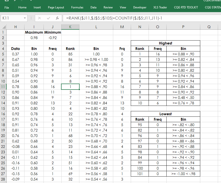
In the image above, the most frequent 10 bar correlation over the last 3,000 5-minute bars for symbol EP versus symbol CLE was 16 times a reading was equal or greater than 0.88 but less than 0.90. In fact the table indicates that recently there has been a positive correlation between symbol EP and symbol CLE. Keep in mind that correlation does not “cause and effect.”
The Charts tab displays four charts. The left two charts are the daily frequency distribution and 300 historical correlation readings. The right hand charts are the 3,000 frequency distributions of intraday correlations and the most recent 300 correlation values.
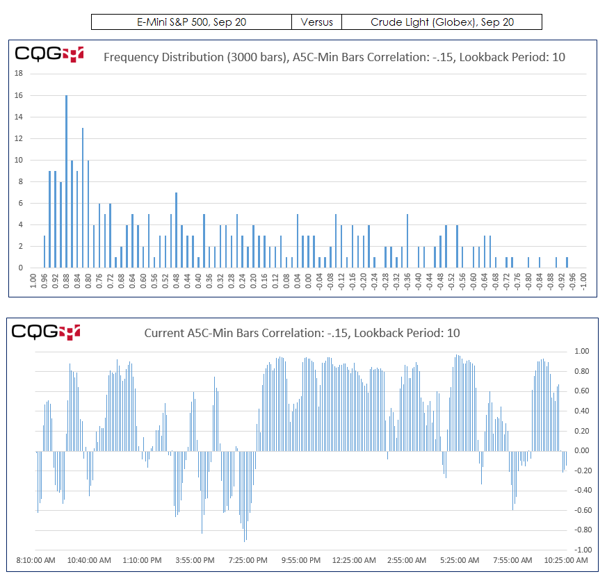
All of the data displayed on the charts is from the Daily and Intraday tabs including the symbols and lookback periods.