This post presents an Excel dashboard for tracking the constituents of the S&P 500 SPYDR ETF.
The S&P 500 is one of the most cited U.S. stock market indices by the medial and analysts.
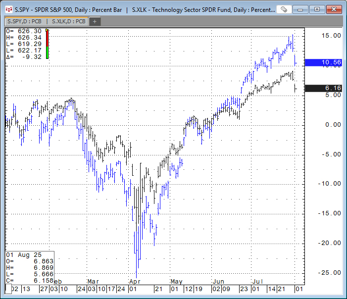
The chart below highlights the performance of the S&P 500 SPYDR ETF (Symbol: SPY, in black) and the Technology Select Sector SPDR® ETF (Symbol: XLK, in green). The two ETFs are highly correlated.
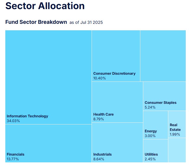
This diagram and table detail the ETF's breakdown by sector.
| Sector | Weight |
|---|---|
| Information Technology | 34.03% |
| Financials | 13.77% |
| Consumer Discretionary | 10.40% |
| Communication Services | 9.86% |
| Health Care | 8.79% |
| Industrials | 8.64% |
| Consumer Staples | 5.24% |
| Energy | 3.00% |
| Utilities | 2.45% |
| Real Estate | 1.99% |
| Materials | 1.83% |
This table details the top ten performing constituents by percentage net change so far for 2025.
The ETFs Top Holdings as of Jul 31 2025
| Name | Symbol | Shares Held | Weight |
|---|---|---|---|
| NVIDIA CORP | NVDA | 298,413,240 | 8.06% |
| MICROSOFT CORP | MSFT | 90,946,680 | 7.37% |
| APPLE INC | AAPL | 182,757,737 | 5.76% |
| AMAZON.COM INC | AMZN | 115,612,518 | 4.11% |
| META PLATFORMS INC CLASS A | META | 26,565,825 | 3.12% |
| BROADCOM INC | AVGO | 57,531,261 | 2.57% |
| ALPHABET INC CL A | GOOGL | 71,210,138 | 2.08% |
| ALPHABET INC CL C | GOOG | 57,440,828 | 1.68% |
| BERKSHIRE HATHAWAY INC CL B | BRKB | 22,435,849 | 1.61% |
| TESLA INC | TSLA | 34,285,799 | 1.61% |
Below is an image of the downloadable Excel Dashboard. During the trading session, the Excel dashboard dynamically ranks the individual stocks. The Excel dashboard displayed below shows the top and bottom fifteen performers as histogram bar charts, along with their respective net percent change for today's trading session.
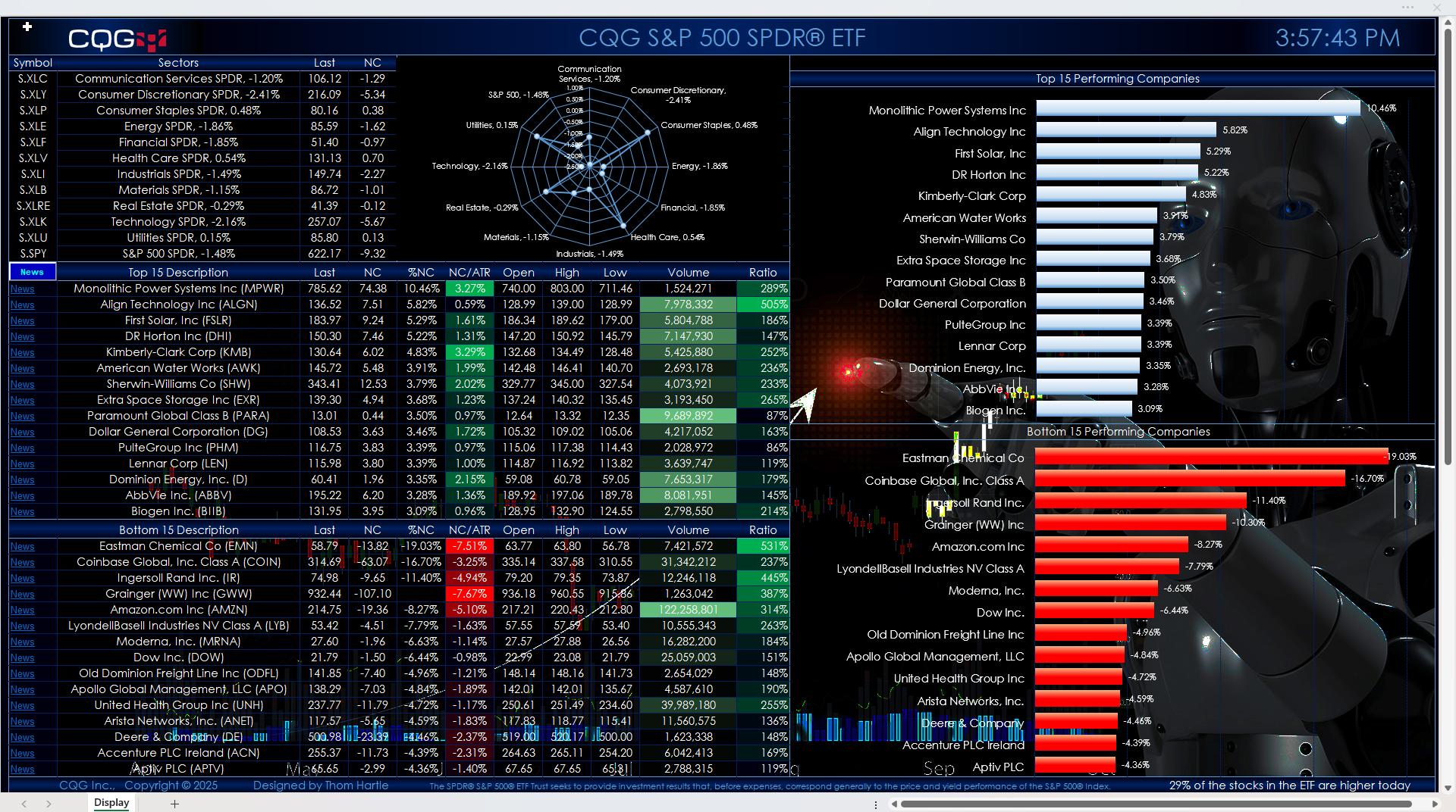
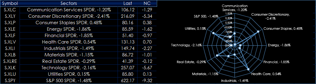
The quotes portion of the display is divided into three sections: The first section details the performance of the S&P Sectors along with a radar map showing today's percentage net change of each sector.
The second section displays the top fifteen performers. The third section displays the bottom fifteen performers.
Quote data includes today's net change as a ratio to the 21-day Average True Range study. Next to today's traded volume is a column that calculates the ratio of today's volume versus the 21-day average of the volume. This ratio column gives you a sense of how active today's trading is. Readings of 100% and higher indicate active trading.
A key feature next to each company name is a link to Yahoo Finance. Clicking the News link will take you to the Yahoo page for that symbol. Note that this could take approximately 30 seconds to open in a browser. Turning off Extensions in your browser will make this happen faster.
If you open another Excel spreadsheet, then this dashboard will no longer be the active spreadsheet. The macro that updates the links and ranks the stocks by performance will stop. To start the macro, simply click the News toolbar button in the first column.
Make sure to lower your Excel Realtime Data (RTD) throttle to 50 milliseconds or lower. Learn how to do that here.
Two dashboards are available: One has a solid black background, and one has an image background.
Requires CQG Integrated Client or CQG QTrader, data enablements for the NYSE and Nasdaq stocks, and Excel 2016 or more recent.