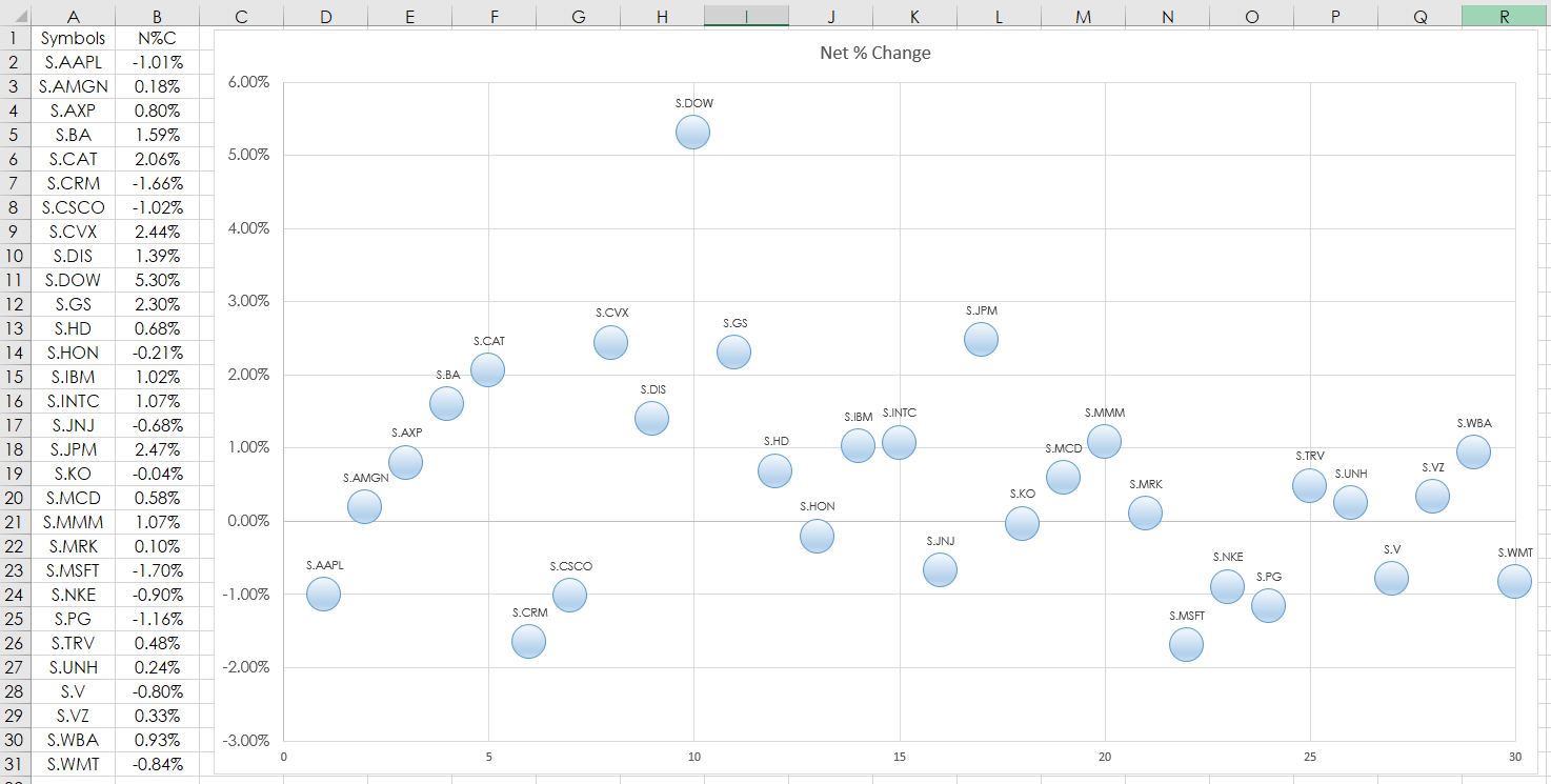
This post details using the Microsoft® Excel “Scatter Plot” Chart to track market performance. In this example, RTD formulas are used to pull in the percent net change of the 30 stocks that are in the Dow Jones Industrial Average from CQG. Two charts are provided. One, is the percent net change using the symbols in alphabetical order, the second chart is the ranked performance sorted by best to worst.
The RTD formula for pulling in net percent change used in column B:
=RTD("cqg.rtd", ,"ContractData",A2, "PerCentNetLastTrade",, "T")/100
The first chart is column B. Select cells B2 through B31 then Insert/Scatter from the Excel ribbon.
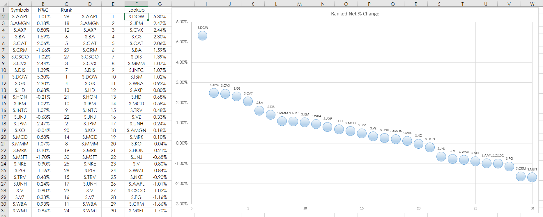
The net percent change can be ranked. Here is a modified Excel Rank function, which will not result in ties:
=RANK($B2,$B$2:B$31)+COUNTIF($B$2:B2,B2)-1
The above Excel formula is copy and pasted down from C2 to C31. Once the values are ranked and the associated symbol is displayed in column D. Values from 1 to 30 are in column E.
The VLookup Excel function then pulls the associated symbol by rank in column F:
=VLOOKUP(E2,$C$2:$D$31,2,FALSE)
The VLookup function returns the symbol and the RTD formula for net percent change is in column G. Column G is the data for the second Scatter chart.
Requires CQG Integrated or QTrader. Strongly recommended: Microsoft Office Professional Excel 2016, 2019, 32 or 64-bits installed on your computer, not in the Cloud.