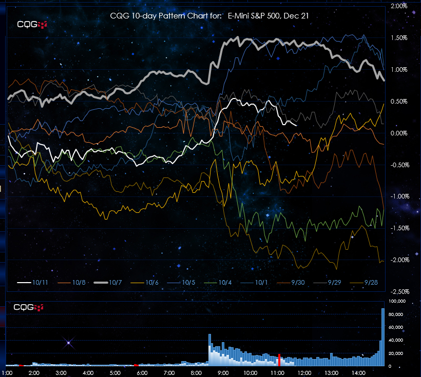
This Microsoft® Excel dashboard has a number of features. The primary feature is the 10-Day Pattern Chart. This chart displays the percent net change on a 5-minute basis for today (the white line) and the previous nine sessions’ percent net change on a 5-minute basis starting at 1:00 am Central time until the current day’s close of the session. Therefore, the chart does not update during the evening session.
This chart makes comparing the current price action easy to the price action of the previous nine sessions. Quickly spot the early current price action as being strong, weak or typical of the current sessions. Does the market tend to rally into the close, sell off or maintain a flat line.
The bottom chart is today’s 5-minute bar volume (white histogram bars), the blue histogram bars are the 10-day average volume and if today’s volume is more than 25% of the 10-day average then the histogram bar for the 5-minute bar is colored red.
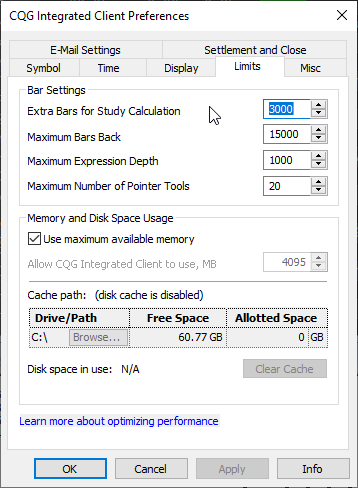
Before using this dashboard a CQG setting needs to be increased. Go to Setup/System Preferences/Limits. Increase “Extra Bars for Study Calculation” to 3000. You will have to restart CQG for the increase to be applied.
Due to the number of data points being pulled in the dashboard can take a few minutes to fully populate.
Please notice in the 10-Day Pattern Chart image that the line for the date 10/7 is bold. In addition, along the color line legend on the chart the date 10/7 is also bold.
Above the box where the symbol is entered is a table. The table has three columns: Date, Correlation and Net Percent Change. The table is sorted by Net Percent Change.
To quickly locate today’s Net Percent Change look for the N/A# in the Correlation column and look to the right.
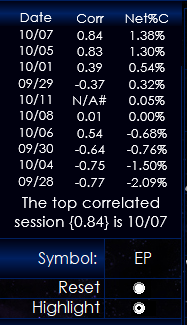
The correlation is calculated from the 1:00 am start of the pulling in of the data and the lookback period expands as the session time expands. This is not a rolling lookback period.
Right above the Chart Symbol box in the image says: “The top correlation session {0.84} is 10/7.” If the date does not match the bolded date in the chart legend then click “Reset” to clear the bold line and then click “Highlight” and the new date line is highlighted. This is intentional. If Excel automatically highlighted the highest correlated session then at the end of the session it could be misleading as that session may not have been the highest correlated session midway through the session.
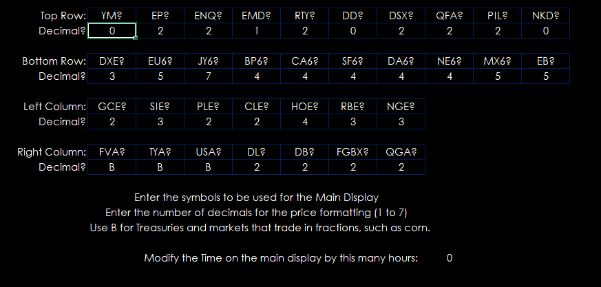
The borders are individual quote displays which can be setup on the Symbols tab. Enter in the symbol using all capital letters and the number of decimals in the price or use “B” for Treasuries or agricultural products. At the bottom you can adjust the time displayed in the top right corner of the Display dashboard.
The histogram chart is a dynamically ranked display of the net percent change of all of the symbols from the Symbols tab.
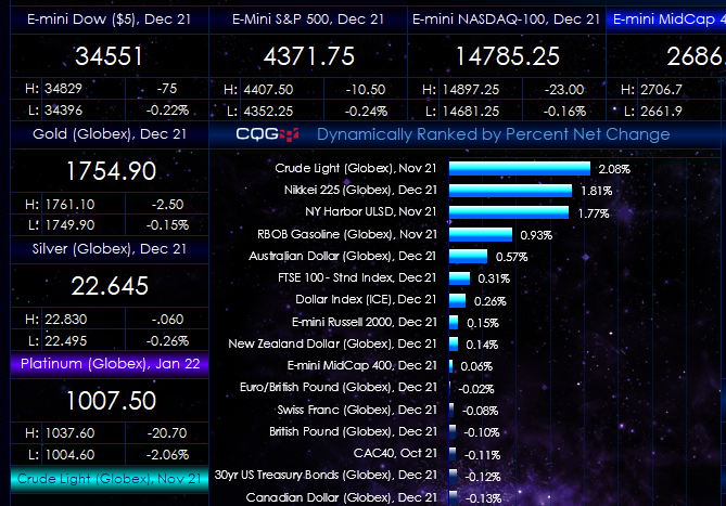
The individual quotes for the markets are ranked based on percent net change and then the descriptions in the individual quote displays are heat-mapped based on performance. The markets with the lowest (negative) percent change are bright red.
The markets with the highest percent net change are bright blue/green.
At the top right hand side you can select “Hide” to hide the Excel ribbon and “Show” to display the Excel ribbon.