Microsoft Excel spreadsheets have functionality to format cells based on conditions. This feature is also referred to as data visualization. This post details two types of data visualizations available in Excel: heat mapping and data bars.
First, what is the value of data visualization? Data visualization is the graphical representation of data. Therefore CQG charts and Quote Spreadsheets are considered data visualization. The charts and quote displays provide an accessible way to see and understand trends, outliers, and patterns.
Using conditional formatting of cells in Excel the user can more easily understand on a comparative basis which markets, stocks, ETFs, commodities and more are outperforming or underperforming without having to do math in their head.
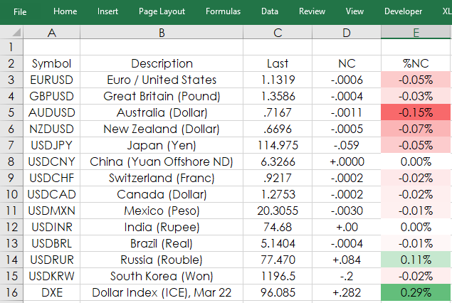
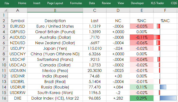
A typical Excel spreadsheet could look like this with a percentage net change column (E) of a collection of markets.
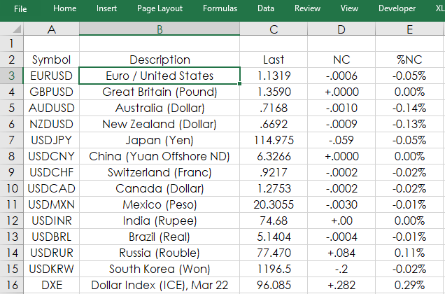
Looking at the %NC column above we can see which FX rates are up and which are down for the session on a percentage basis. However, the user has to focus and compare values, basically do math in their head, to determine which market is the strongest and which is the weakest.
Using Excel's Conditional Formatting (found on the Home tab) there are a number of features available to highlight high and low values when applied to a range of values.
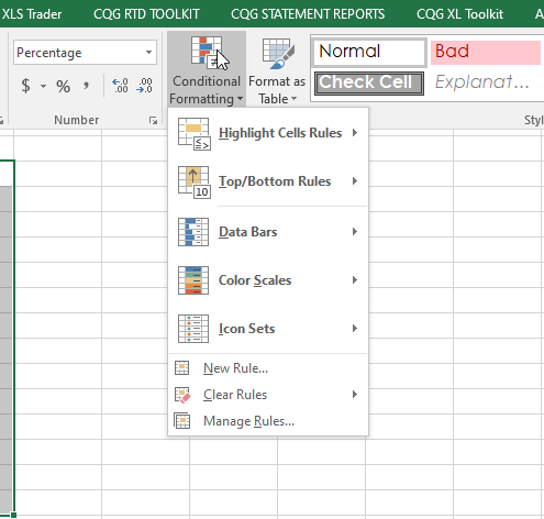
To apply a heat map you select the range of values and then from Excel’s Home tab choose Conditional Formatting and then select "New Rule".
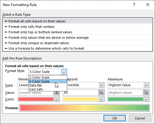
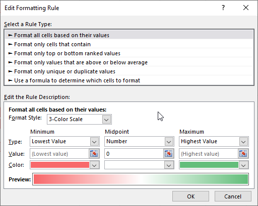
For heat mapping select Format Style: 3-Color Scale. Select Midpoint: Number and 0. For the Midpoint color choose a color that matches the background for the spreadsheet, here it is white.
Now, the %NC column is heat mapped. Your eye will easily recognize the extreme high and low % NC readings, as well as the more neutral readings.
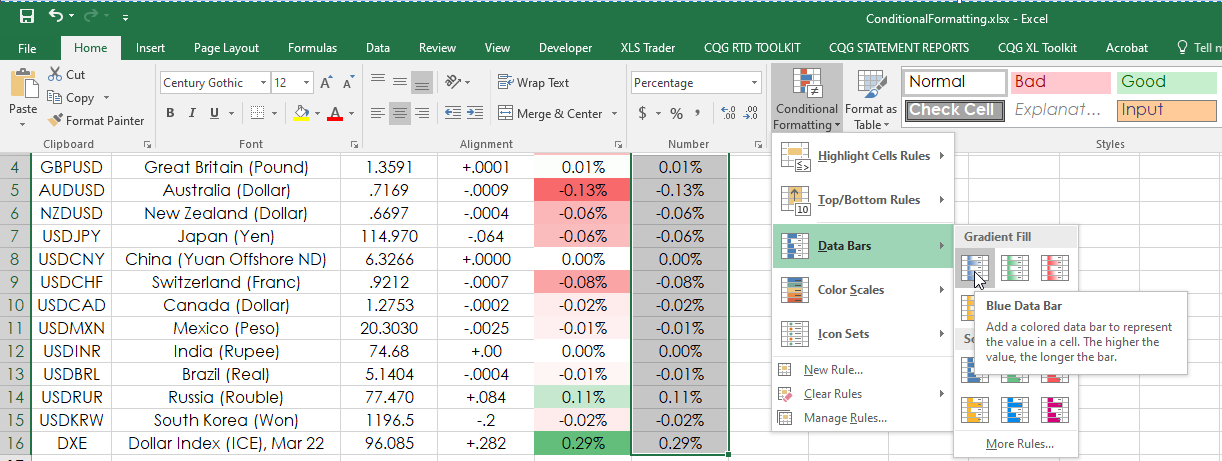
The second data visualization feature, Data Bars, presents horizontal bars in the cells reflecting the amount of positive %NC and negative %NC. The values in column F are referenced from column E. Select the cells in column F and from the Home tab choose Conditional Formatting and select Data Bars.
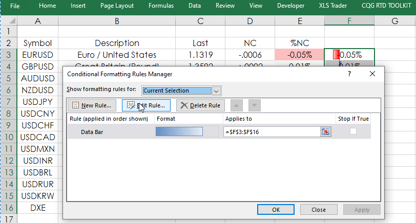
The Data Bars are applied to the cells and by default will display the values. As the values are displayed in column E the values are unnecessary in column F and give it a cluttered look. Select the cells in column F and from the Home tab select Conditional Formatting and the choose "Edit Rule."
The menu enables you to ""Show Bar Only."
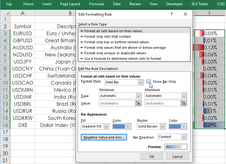
Once checked and selecting “OK” will remove the values.
This post walked through applying heat mapping and data bars for making the Excel quote board display easier to interpret. These two same features are available in CQG Quote Spreadsheet 2.0. Here is a link to the Help File for Heat Mapping and a link to the Help File for Data bars.
Requires CQG IC or QTrader and Excel 2013 or higher installed on your computer, not in the Cloud.