Microsoft® Excel 2016 and higher offer a new chart type: The Treemap. A treemap chart provides a hierarchical view of your data. This view makes it easy to spot patterns, such as which markets are outperforming or underperforming in a group of markets. The tree branches are represented by rectangles and each sub-branch is shown as a smaller rectangle. The treemap chart displays categories by color and proximity and can easily display a group of data.
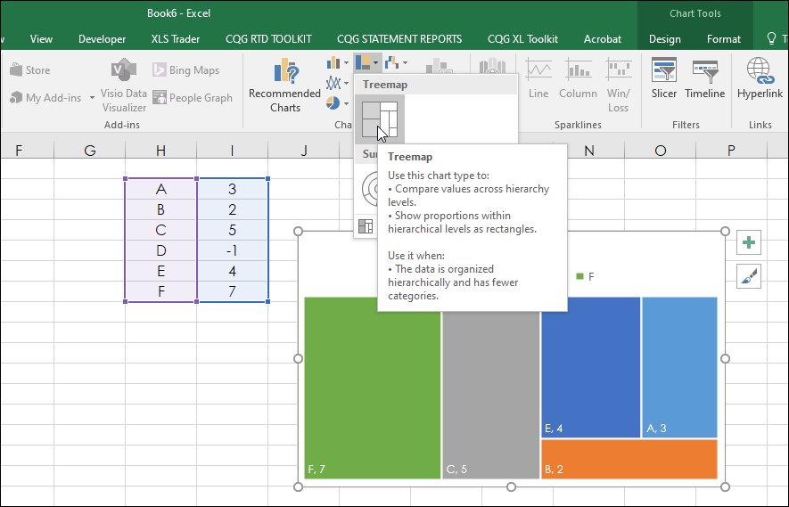
The chart displays the values as rectangles which are raked from the highest value to the lowest value and the area of the rectangles represents the hierarchical value. Notice, that in the data in column I for the symbol D’s value is -1. As the area of a rectangle cannot be a negative number then the treemap chart skips the symbol and value.
This is an important point. For example, you could not create a treemap chart for a list of symbols based on the current session’s net percent change because any symbols with a negative net percentage change would be skipped.
There are two tabs: A Data tab and the Treemap chart tab.
The data tab is for the calculations.
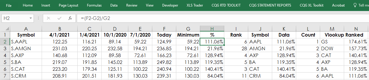
Column A is the symbol column (stock symbols should always use “S.”).
All formulas are simply entered and copied down.
Columns B through E are the RTD functions for the quarterly data:
= RTD("cqg.rtd",,"StudyData",A2, "Bar", "", "Low","Q","0",,,,,"T") = RTD("cqg.rtd",,"StudyData",A2, "Bar", "", "Low","Q","-1",,,,,"T") = RTD("cqg.rtd",,"StudyData",A2, "Bar", "", "Low","Q","-2",,,,,"T") = RTD("cqg.rtd",,"StudyData",A2, "Bar", "", "Low","Q","-3",,,,,"T")
Column F is today’s last price. Before the markets open there is no last price and the RTD formula returns a blank cell, which generates errors. To avoid that if there is no last price then the previous day’s last price is used:
=IF( RTD("cqg.rtd",,"StudyData",A2, "Bar", "", "Close","D","0",,,,,"T")="", RTD("cqg.rtd",,"StudyData",A2, "Bar", "", "Close","D","-1",,,,,"T"), RTD("cqg.rtd",,"StudyData",A2, "Bar", "", "Close","D","0",,,,,"T"))
The minimum of the quarterly lows are found in column G:
=MIN(B2:E2)
Column H calculates the ratio as a percentage:
=(F2-G2)/G2
Column I ranks the Column H for another purpose later on. The Excel function removes ties found in the ranking process using COUNTIF:
=RANK($H2,$H$2:H$31)+COUNTIF($H$2:H2,H2)-1
Column J and K is the symbol (the “S.” is removed for space in the treemap chart) and the respective percentage difference between the quarterly low and today’s price and is the source of the treemap chart found on the Treemap tab.
=RIGHT(A2,LEN(A2)-2) =H2
Column M and N sort the data from highest to lowest using VLOOKUP for a label on the chart detailing the highest and lowest percentage ratio and their respective symbols.
=VLOOKUP(L2,$I$2:$K$31,2,FALSE) =VLOOKUP(L2,$I$2:$K$31,3,FALSE)
Here is the image of the treemap chart found on the Treemap chart tab:
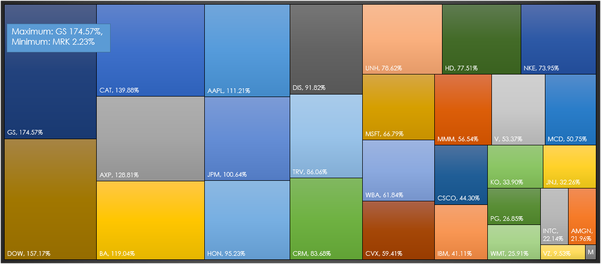
The maximum is Goldman Sachs (symbol: GS) and the minimum is Merck & Co., (symbol: MRK).
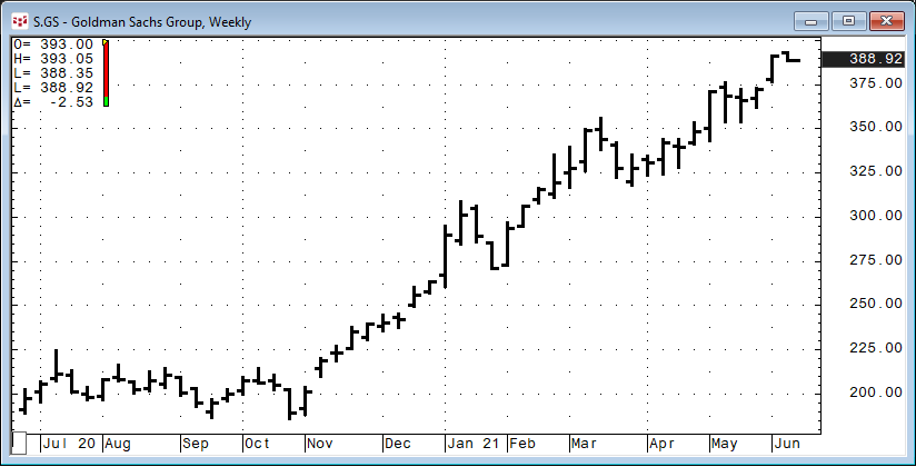
Here is the CQG chart of GS, which is very close to the high and a considerable distance from the four quarterly lows:
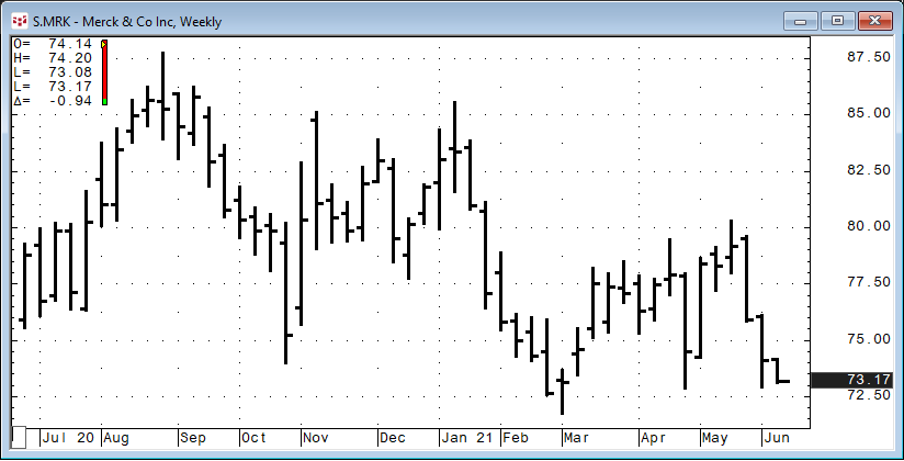
Here is the CQG chart of MRK, which is very close to the four quarterly lows:
The treemap chart is another way to look at data using the hierarchal process for better data visualization.
Requires CQG Integrated Client or QTrader. Requires Microsoft Office Professional Excel 2016, 2019, 32 or 64-bits installed on your computer, not in the Cloud.