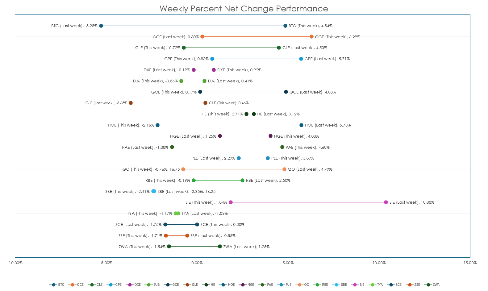
Dumbbell charts have the name due to the look of the data displayed having the appearance of a dumbbell.
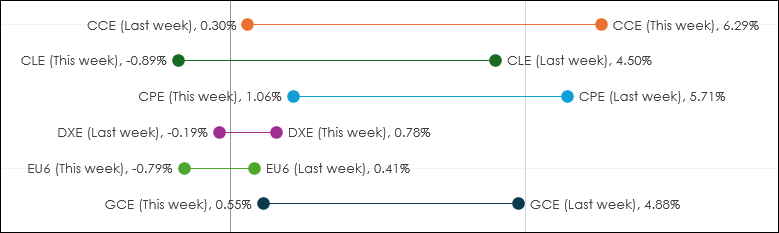
In other words, a circle at each end connected by a line. In the image above the top circle on the right is this week's current percentage net change for cocoa (symbol: CCE), and the circle connected by the line is last week's percentage net change. We can easily see that so far for the week cocoa is up 6.29% and last week cocoa finished the week up 0.30%.
Right below cocoa's weekly performance is crude oil (symbol: CLE). Here, crude oil is down -0.89% while last week, crude oil was up 4.50%.
The benefit of the dumbbell chart format is a quick analysis of a number of markets is easily attained. The downloadable macro enabled Excel sample available at the bottom of the post displays 21 markets.
Excel does not have a dumbbell chart type, but working with Excel's Scattergram chart the dumbbell chart can be duplicated.
To start, the data in the downloadable spreadsheet at the end of the post is laid out with cell I4 as the symbol. Next, cells I5 and I6 are the calculations for the weekly percent net change using RTD calls.
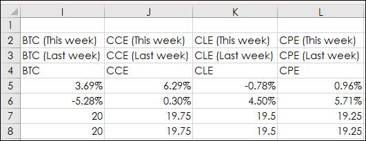
For the current weekly percent bet change the RTD formula is:
=(RTD("cqg.rtd",,"StudyData",I$4,"BAR","","Close",$H$4,0,$H$6,$H$10,,$H$8,$H$12)-RTD("cqg.rtd",,"StudyData",I$4,"BAR","","Close",$H$4,-1,$H$6,$H$10,,$H$8,$H$12))/RTD("cqg.rtd",,"StudyData",I$4,"BAR","","Close",$H$4,-1,$H$6,$H$10,,$H$8,$H$12)Notice in the RTD formula above that the parameters are from a block of cells in column H.
The RTD formula is simply the current weekly (live) close minus last week's close and the difference is divided by last week's close.
Cell I6 has this formula:
=(RTD("cqg.rtd",,"StudyData",I$4,"BAR","","Close",$H$4,-1,$H$6,$H$10,,$H$8,$H$12)-RTD("cqg.rtd",,"StudyData",I$4,"BAR","","Close",$H$4,-2,$H$6,$H$10,,$H$8,$H$12))/RTD("cqg.rtd",,"StudyData",I$4,"BAR","","Close",$H$4,-2,$H$6,$H$10,,$H$8,$H$12)Cells I5 and I6 are the two values for the X-axis in the dumbbell chart. Cells I7 and I8 are the two values used for the Y-axis.
Cells I2 and I8 concatenate (This week) and (Last week) with the symbol in I4.
=I4&" (This week)"
=I4&" (Last week)"
These two cells are used for the labels in the dumbbell chart.
The formulas in the cells I2 through I8 can be selected and copied over to the right. Then simply change the symbols in Row 4.
To build the dumbbell chart select an area in the spreadsheet, then select Insert/Chart and choose the XY (Scatter). You should see this:
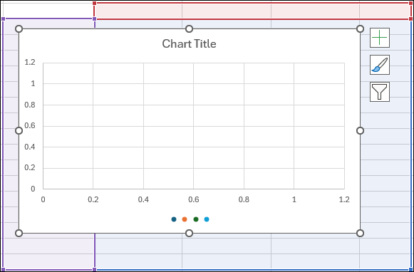
Right-click in the chart and choose "Select Data". This dialog opens:
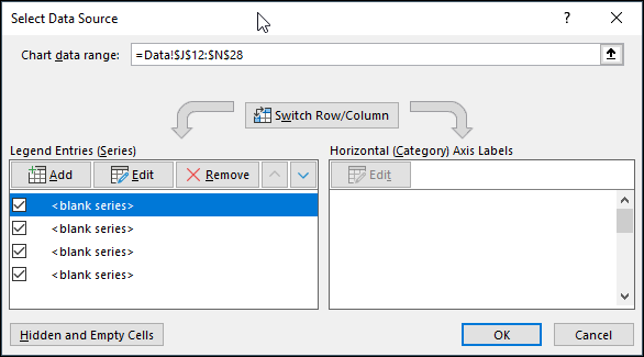
Remove the four series and click "Add." This dialog opens:
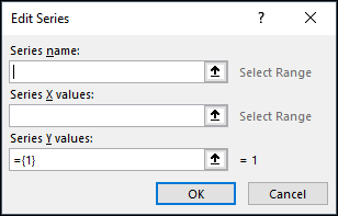
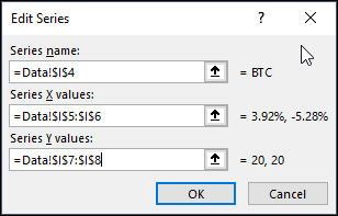
Add the cell references for Series Name, Series X values and Series Y values:
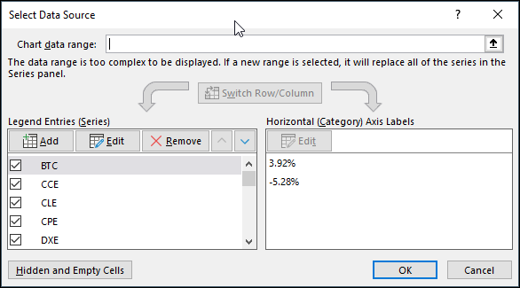
Repeat this for all of the data points you want to display.
Once the chart is filled with the data points, then right-click on a data point and select "Format Data Series."
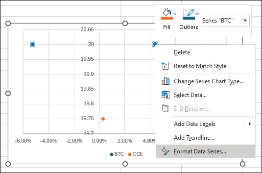
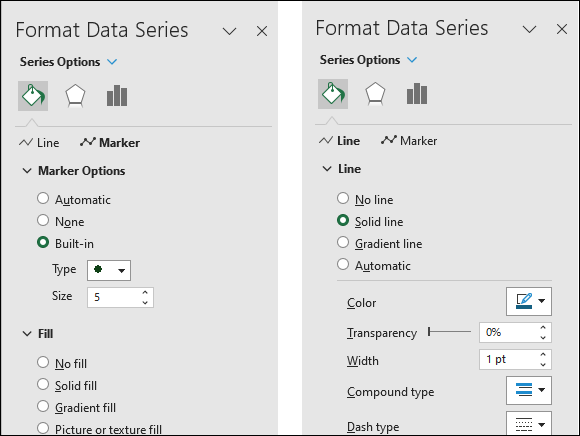
This next step allows you to select the size, style and color of the Marker and the Line connecting the two Markers. This step needs to be performed for each data series. The provided Excel sample sets the Markers to 5 points and the Line to 1 point.
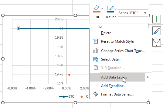
The final step is to add the labels to each data series. Right-click on the individual data series and select "Add Data Labels".
Then, a data label is added at the end of the data series. Right-click on the data label and select Format Data Labels.
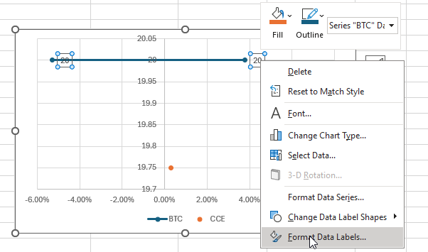
Check on X Value and Value From Cells, then enter Select Data Label Range from the spreadsheet. In this case, the first one are cells $I$2:$I$3.
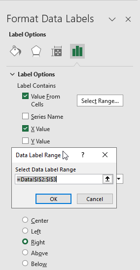
Click OK and close the dialog. To make the data labels set to the right or left of the marker, right-click one label and again select Format Data Labels and select Right and then repeat and select Left. The sample spreadsheet has macros to do this task.
The downloadable sample spreadsheet looks like this:
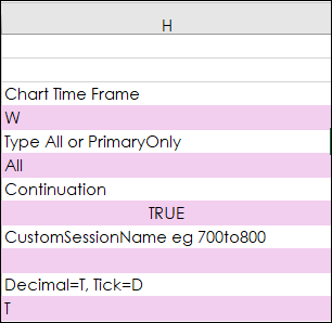
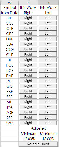
The symbols can be changed on the Data tab starting with cell I4. Use all capital letters.
One issue though, is Excel cannot determine automatically which side of the data series the labels should be linked to. For example, the market may be higher this week than last week and therefore the This Week data label should be on the right-hand side of the displayed data series. Then, let's say the market declines below last week's close and therefore the dumbbell will switch to show the negative percentage net change to be on the left side. However, Excel will not automatically flip the data label to the left hand side.
The solution is a selection of macros that will flip the data labels from one side to the other based on the symbol. In addition, a macro is included to rescale the X-axis of the chart using adjusted minimum and maximum to account for the labels.
Dumbbell charts offer a comparable performance view in a compact area making analysis more efficient. Reminder: All symbols used are entered on the data tab starting with cell I4.
Requires CQG Integrated Client or CQG QTrader, and Excel 2016 or more recent.