A Pareto chart is a histogram chart displaying columns sorted in a descending order and a line representing the cumulative total percentage. Pareto charts highlight the largest factors in a data set.
The Pareto principle (also known as the 80/20 rule) is a phenomenon that states that roughly 80% of outcomes come from 20% of causes.
For example, supposedly:
- 20% of drivers cause 80% of all traffic accidents.
- 80% of pollution originates from 20% of all factories.
- 20% of a company's products represent 80% of sales.
- 20% of employees are responsible for 80% of the results.
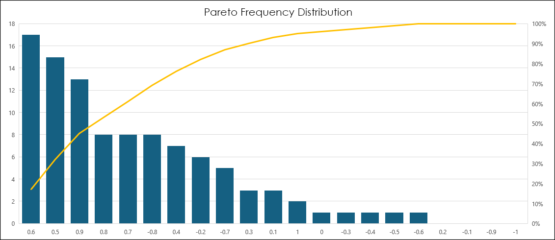
However, this post is utilizing the Pareto chart for market analysis using the automatic sorting of columns in a descending order feature. This next image is a Pareto chart detailing the Frequency Distribution of a correlation analysis presented in the post "Excel's Implicit Intersection Operator."
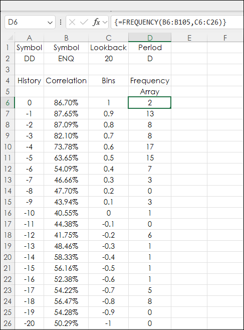
First, a review of the Frequency Distribution post. The original post included a sample spreadsheet that reviewed 100 sessions of correlation analysis of the two symbols in cells A2 and B2 in the next image (the downloadable sample includes this functionality).
Excel's FREQUENCY function was used to determine the number of occurrences of correlation values in the bins (cells B6 to B26) ranging from +1 to -1. The values were returned as an array in cells D6 to D26.
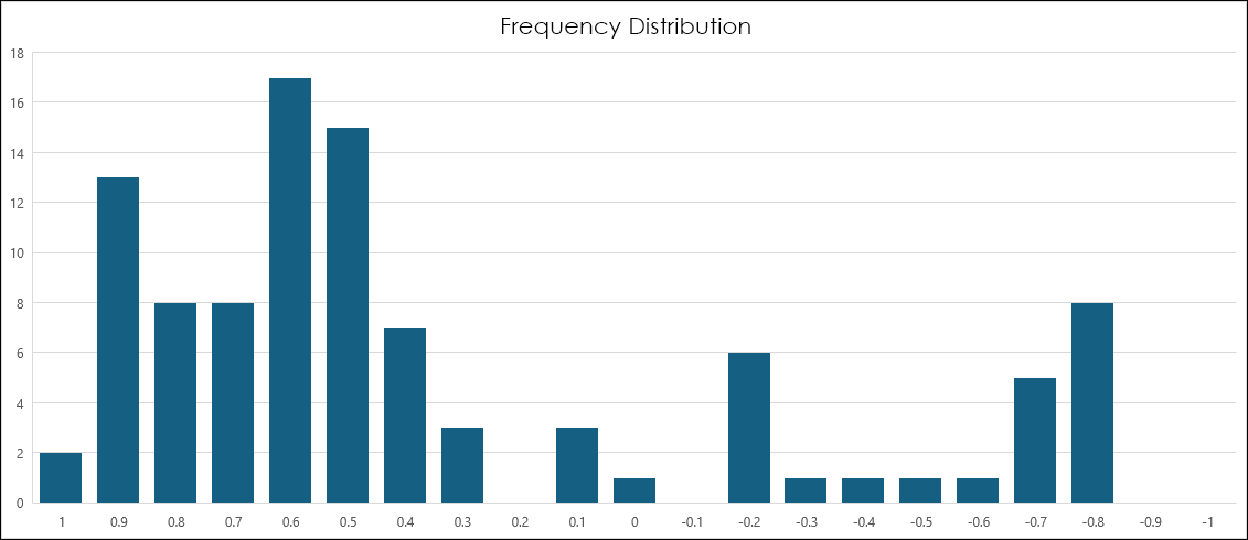
The next image displays the values plotted as histograms.
To plot the data as a Pareto chart:
- Select the data for the Y-Axis (cells D6:D26 from the example above)
- Select the Pareto chart (on the Excel ribbon select Insert/Recommended Charts/Pareto)
- Add the X-Axis data (right-click the chart/Select Data)
- Select the X-Axis data (cells B6:B26 from the example above)
- Right-click the X-Axis and select Format Axis
- Select By Category
The results are histograms in descending order with the bin listed on the X-axis and the line is the cumulative total percentage. Now, the chart reveals the bins with the highest counts.
The original Frequency Distribution could have been ranked and sorted in Excel, but the Pareto chart does that step automatically.
This next image lists the features available for formatting the X-Axis and the parameter details are from the Microsoft Help page.
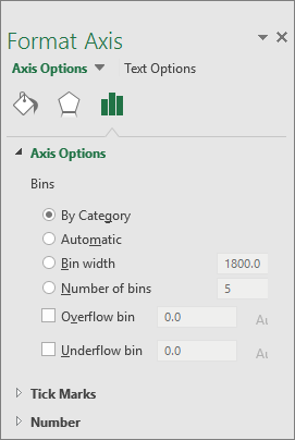
- By Category: The default when both data and text are plotted. The text categories are plotted on the horizontal axis and graphed in descending order. Tip: To count the number of appearances for text strings, add a column and fill it with the value "1", then plot the Pareto chart and set the bins to By Category.
- Automatic: This is the default for Pareto charts plotted with a single column of data. The bin width is calculated using Scott's normal reference rule.
- Bin width: Enter a positive decimal number for the number of data points in each range.
- Number of bins: Enter the number of bins for the Pareto chart (including the overflow and underflow bins). The bin width will adjust automatically.
- Overflow bin: Check the box to create a bin for all values above the number in the corresponding box. To change this value, enter a decimal number into the box.
- Underflow bin: Check the box to create a bin for all values below or equal to the number in the corresponding box. To change this value, enter a decimal number into the box.
The automatic formatting of the data to descending histograms is helpful for data visualization of other market data, such as sector performance. This image is the data detailing the one year percentage change of the eleven sectors.
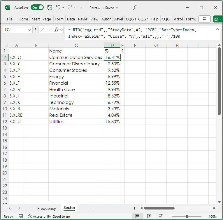
The next image (as of 8/9/2024) is the Pareto Chart analysis of the sector performance.
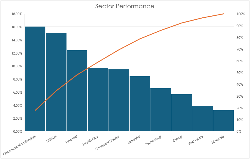
The Pareto Chart is a unique and interesting way to graph market data.
Requires CQG Integrated Client or CQG QTrader, and Excel 2016 or higher. Excel has to be installed on the local computer, not in the cloud.