
This post details a macro-enabled Excel Dashboard for monitoring Soybeans, Soybean Meal, and Soybean Oil contracts. The macro is a feature for managing the price axis on the charts. Excel may use zero for the minimum which compresses the chart data. The macro will adjust the price axis. It does require the user to hit the "Rescale Charts" button to correct the charts.
The left side of the dashboard has three sections detailing the first 12 contracts' current sessions performance for Soybeans, Soybean Meal, and Soybean Oil contracts. The data is Open, High, Low, Last Trade, NC, the current session Traded Volume, the previous sessions change in Open Interest, the Settlement price and the contract's Delivery Month.
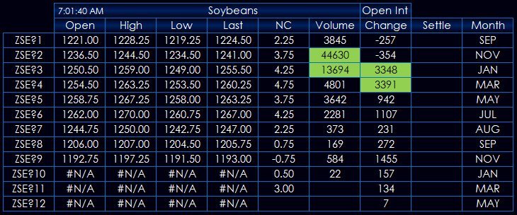
The top two contracts with the highest traded volume are highlighted with a green background. The top two contracts with the largest increase in open interest are highlighted with green backgrounds.
Notice in the image above the bottom three contracts are displaying the #N/A error. This Excel formula replaces a blank value with the "NA()" error which returns "#N/A".
=@IF(@CQGContractData(B15, "OPen", "-1", "T")="",NA(),CQGContractData(B15, "OPen", "-1", "T"))
The purpose of using the "#N/A" error is an Excel chart that sees a blank value treats the blank value as 0 and that can cause an issue for the price scale of the chart. If Excel sees the "#N/A" error in the cell then the chart skips the value.
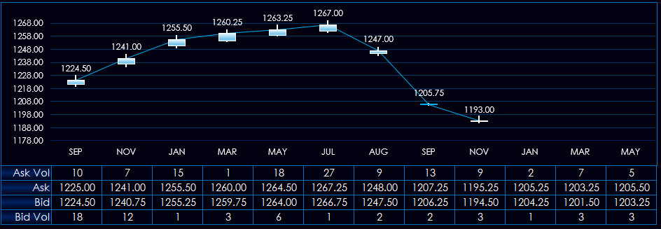
The dashboard includes three forward curve charts for Soybeans, Soybean Meal, and Soybean Oil contracts.
The typical forward curve chart is a simple line chart connecting the closes of the contracts. This dashboard is displaying candlestick bars showing the open, high, low and close of each contract on the forward curve. The bottom of the chart displays the bid volume, best bid, best ask, and ask volume for each contract.
The full dashboard is shown below. Notice in the top middle is a button "Rescale Charts." This is a macro to adjust the price scale of the charts.
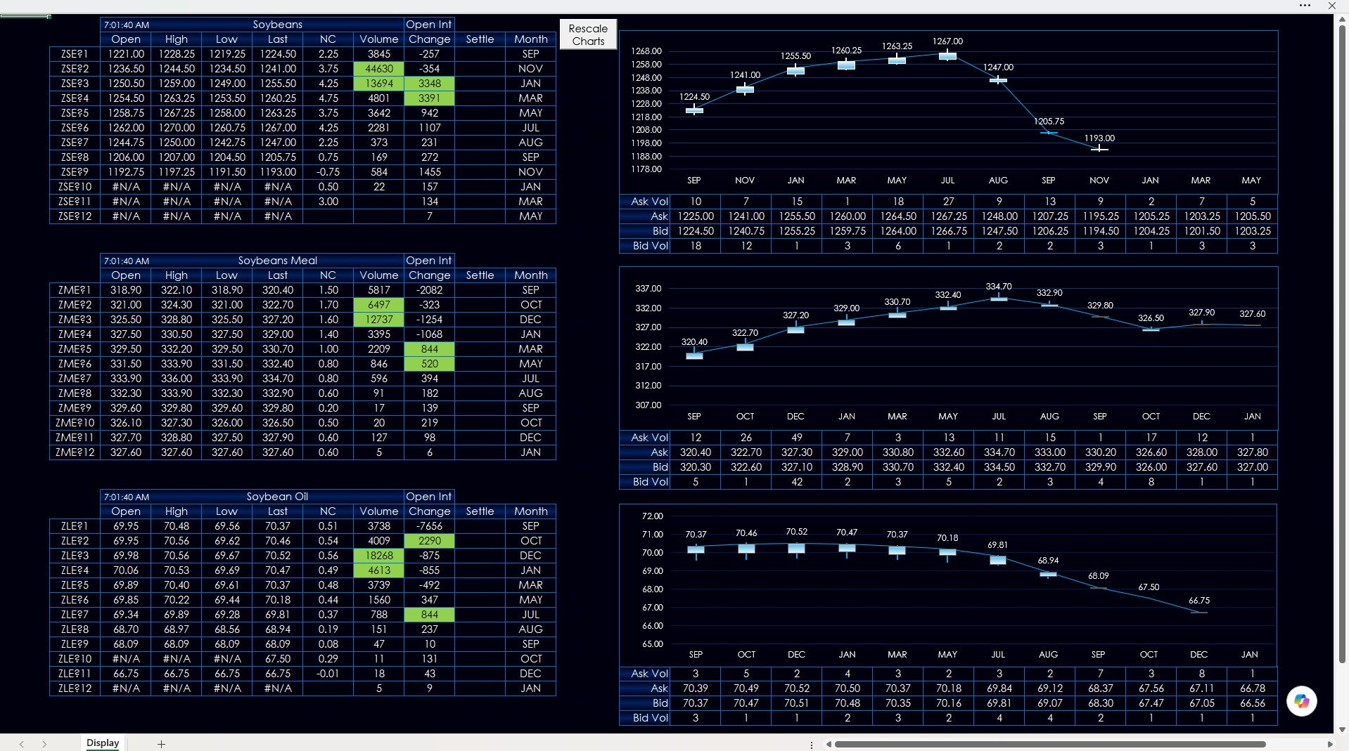
Excel will often use zero as the minimum price for a chart which compresses the displayed data along the top of the chart. The macro uses the maximum of the highs and the minimums of the lows with some padding to set the prices scales.
The dashboard is locked to avoid accidental editing. However, a password is not required to unlock the dashboard for anyone wanting to understand how the Excel and RTD functions are used in the dashboard. Clicking "Rescale Charts" will lock the dashboard.
Make sure to lower your Excel Realtime Data (RTD) throttle to 100 milliseconds. Learn how to do that here.
Requires CQG Integrated Client or CQG QTrader, data enablements for the CME Group, and Excel 2016 or more recent locally installed, not in the Cloud.