
This macro-enabled Microsoft Excel® spreadsheet tracks the holdings of the iShares Core S&P U.S. Growth ETF (symbol: IUSG). The iShares Core S&P U.S. Growth ETF seeks to track the… more
Equity
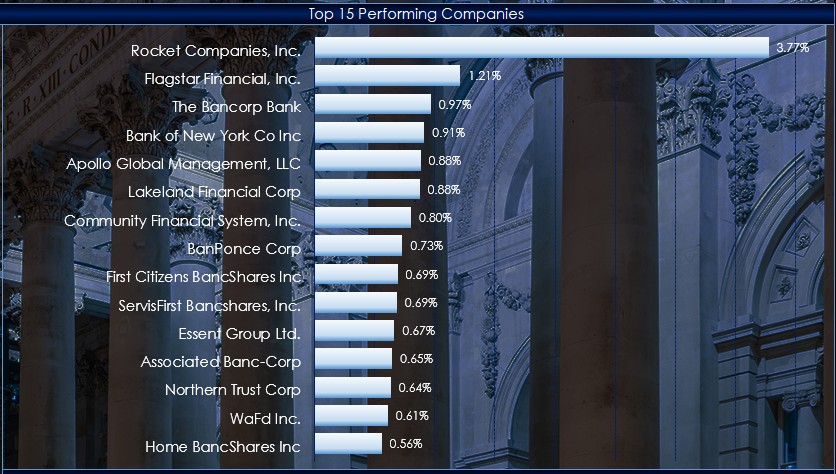
This macro-enabled Microsoft Excel® spreadsheet tracks the holdings of the SPDR® S&P® Bank ETF (symbol: KBE).
Throughout the trading session, the individual stocks are dynamically ranked… more
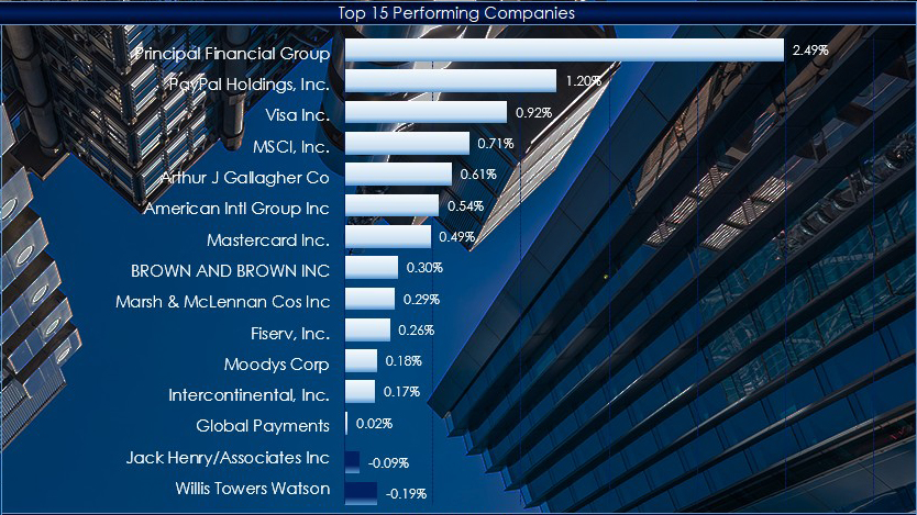
This macro-enabled Microsoft Excel® spreadsheet tracks the holdings of the Financial Select Sector SPDR® ETF (symbol: XLF).
Throughout the trading session, the individual stocks are… more
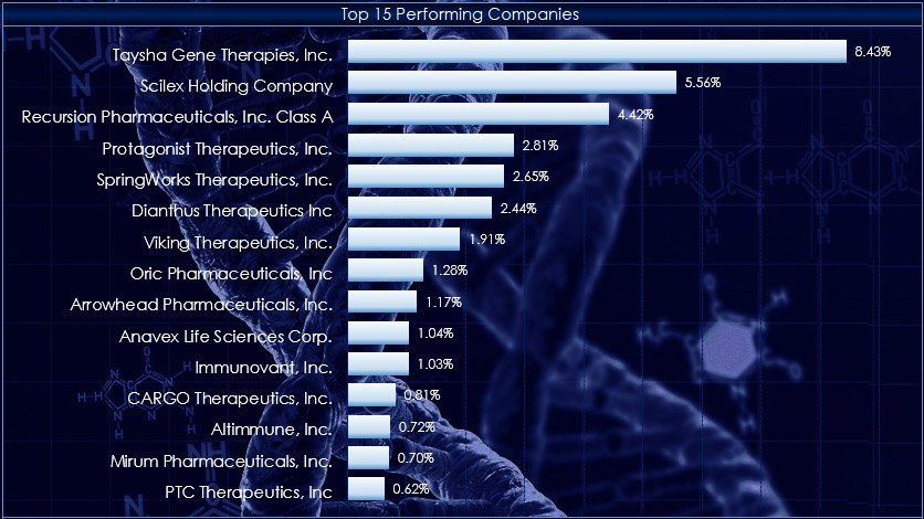
This macro-enabled Microsoft Excel® spreadsheet tracks the holdings of the SPDR® S&P® Biotech ETF (symbol: XBI).
Throughout the trading session, the individual stocks are dynamically… more
Recent posts detailed observing market data during pre-, current, and post-market sessions. The post View Pre and Post Sessions for Stocks detailed the steps to displaying a chart that included… more
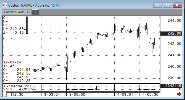
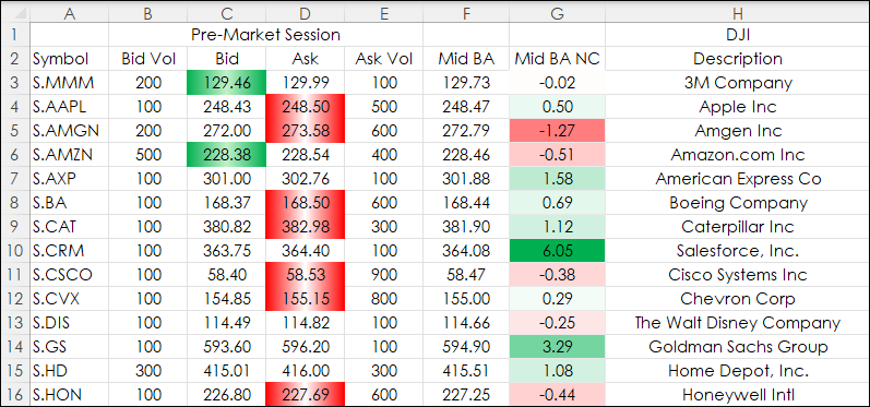
CQG IC and QTrader users can chart bid and ask orders activity for stocks during pre-market trading hours and after-market trading hours. This requires a custom session and setting the chart data… more
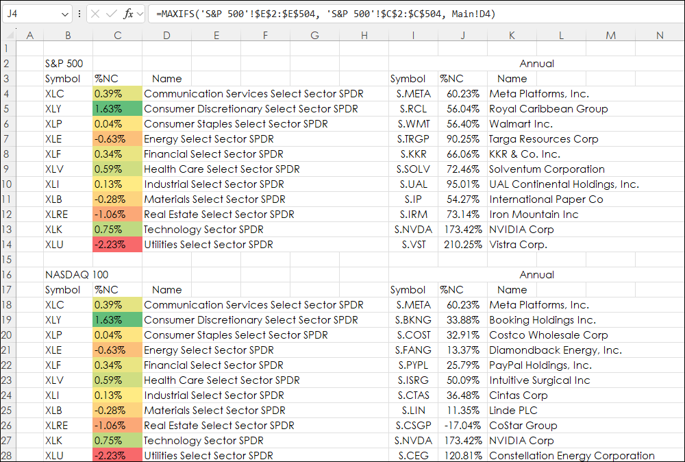
The Excel MAXIF function returns the maximum value from a range of cells and a criteria range. For example. The downloadable sample at the bottom of this post is determining the best performance… more
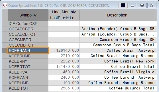
Certified stocks are bags of coffee that have been graded by the ICE exchange by ICE approved graders and are warehoused in exchange approved warehouses around the world. ICE reports the current… more
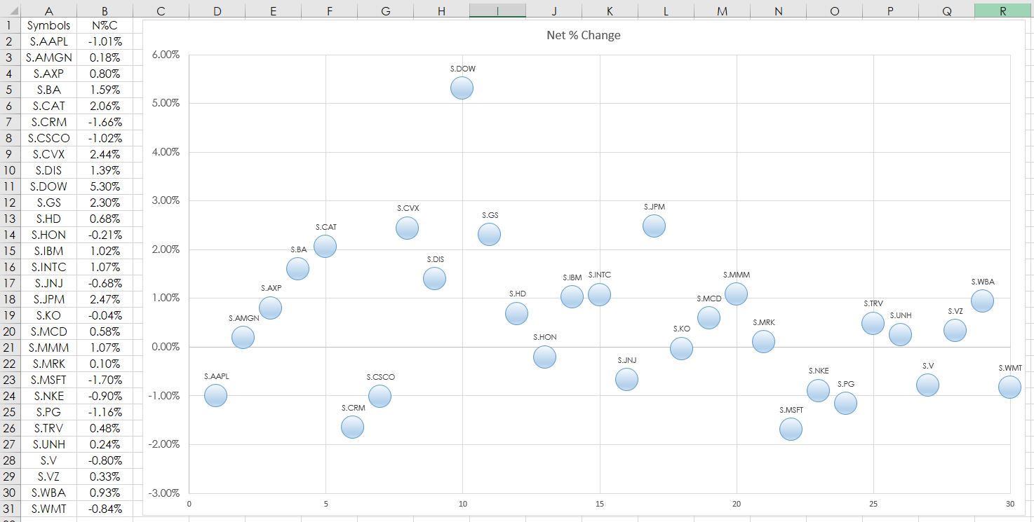
This post details using the Microsoft® Excel “Scatter Plot” Chart to track market performance. In this example, RTD formulas are used to pull in the percent net change of the 30 stocks that are in… more
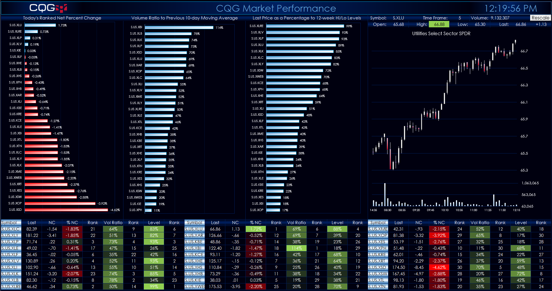
This Microsoft® Excel Dashboard comes frontloaded with 30 Sector and Industry symbols. However, you can enter in whatever symbols you like using the Symbols tab. The long description of the symbol… more