The Microsoft® Excel 3-D chart is different from the Excel Scatter Plot chart. The Scatter chart uses a fixed size for the chart data points. The 3-D chart accesses an additional column to set the width of the chart data points. In this post setting up a 3-D chart is detailed for monitoring the S&P 500 and the sectors using the Select Sector SPDR® Fund symbols.
First, the downloadable Excel sample has this table of data in the top left-hand corner.
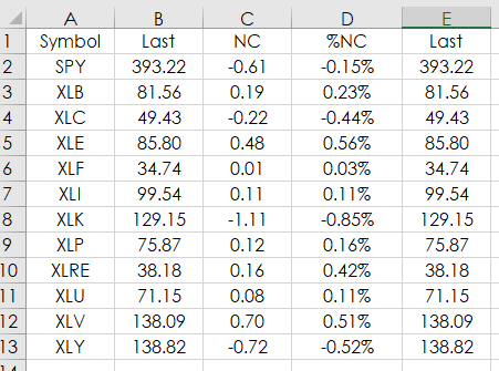
- Column A: Symbol
- Column B: Last Trade
- Column C: Net Change
- Column D: % Net Change
- Column E: Last Trade
Column E repeats using the value of the Last Trade for setting the width of the chart data points.
The symbols include:
| Symbol | Description |
|---|---|
| SPY | SPDR S&P 500 |
| XLB | Materials Select Sector SPDR |
| XLC | Communication Services Select Sector SPDR |
| XLE | Energy Select Sector SPDR |
| XLF | Financial Select Sector SPDR |
| XLI | Industrial Select Sector SPDR |
| XLK | Technology Sector SPDR Fund |
| XLP | Consumer Staples Select Sector SPDR |
| XLRE | Real Estate Select Sector SPDR |
| XLU | Utilities Select Sector SPDR |
| XLV | Health Care Select Sector SPDR |
| XLY | Consumer Discretionary Select Sector SPDR |
At the time of this writing the market values generated by RTD formulas in Excel are displayed below.
The RTD formulas:
Last: =RTD("cqg.rtd", ,"ContractData",A2, "LastTrade",, "T")
NC: =RTD("cqg.rtd", ,"ContractData",A2, "NetLastTrade",, "T")
%NC: =IFERROR(RTD("cqg.rtd",,"ContractData",A2,"PerCentNetLastTrade",,"T")/100,(RTD("cqg.rtd",,"StudyData",A2, "Bar", "", "Close","D","-1",,,,,"T")-RTD("cqg.rtd",,"StudyData",A2, "Bar", "", "Close","D","-2",,,,,"T"))/RTD("cqg.rtd",,"StudyData",A2, "Bar", "", "Close","D","-2",,,,,"T"))
The RTD formulas for %NC uses the difference between one day and two days back if the “percent net last trade” is not available, which occurs before the start of the next session.
To display the 3-D Bubble chart cells D2:E13 were selected.
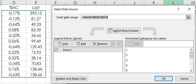
And, then from the X Y (Scatter) group 3_D Bubble was chosen.
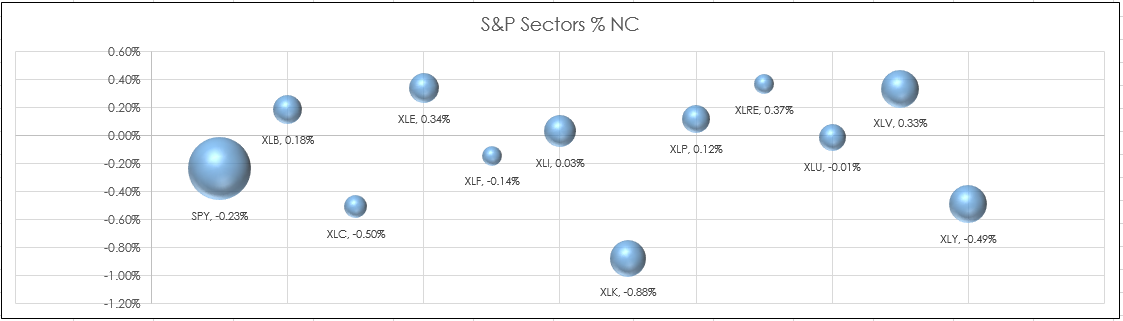
Column E (Last price) determines the width of the bubble data point. And, because the last price for SPY is more than two to three times the prices for the Sector ETFs the bubble is three times the width of the other symbols. Looking at the above image you see that three of the ETFs have a lower percent net change and the others have a higher percent net change. A more efficient display would be to rank the percent net changes of each instrument and then display the instruments by market performance.
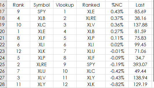
The image above shows the Excel spreadsheet ranking in cell A17:A19 the percent net change from cells D2: D13. The Excel function does not allow ties. Read more here.
=RANK(D2,$D$2:$D$13,0)+COUNTIF($D2:D$13,D2)-1
Column D uses VLookup to display the top to bottom performing instruments.
=VLOOKUP(C17,$A$17:$B$28,2,FALSE)
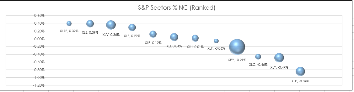
Displaying the instruments by ranked performance is an improvement. Again, the SPY 3-D bubble is three times larger and you easily see which ETFs are out performing SPY and which are not.
Requires CQG Integrated Client or CQG QTrader and Excel 2010 or more recent installed on the computer, not in the cloud.