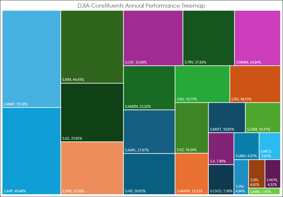
The Excel Treemap chart displays a hierarchical view of the data. The Treemap chart below displays the annualized performance of the 30 stocks in the Dow Jones Industrial Average. The size of the squares indicates the relative performance with Walmart Inc. (S.WMT) up the most and Merck & Co Inc (S.MRK) up the least.
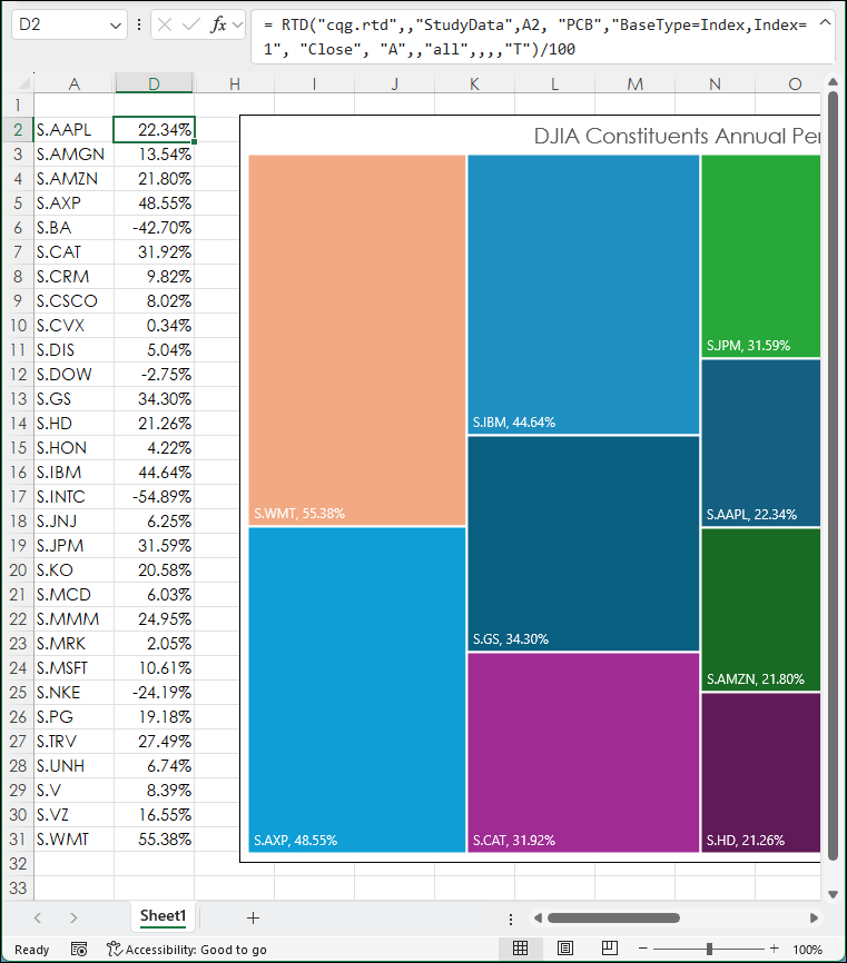
The data is from column D in the spreadsheet. Notice in the image below that there are negative values, such as Boeing Inc. (S.BA).
Excel Treemap charts cannot work with negative values because Excel is calculating an area for the Treemap chart, and an area cannot be negative. The only solution is to create a second Treemap chart for those stocks that are negative for the year and manipulate the description to display the symbol and negative value.
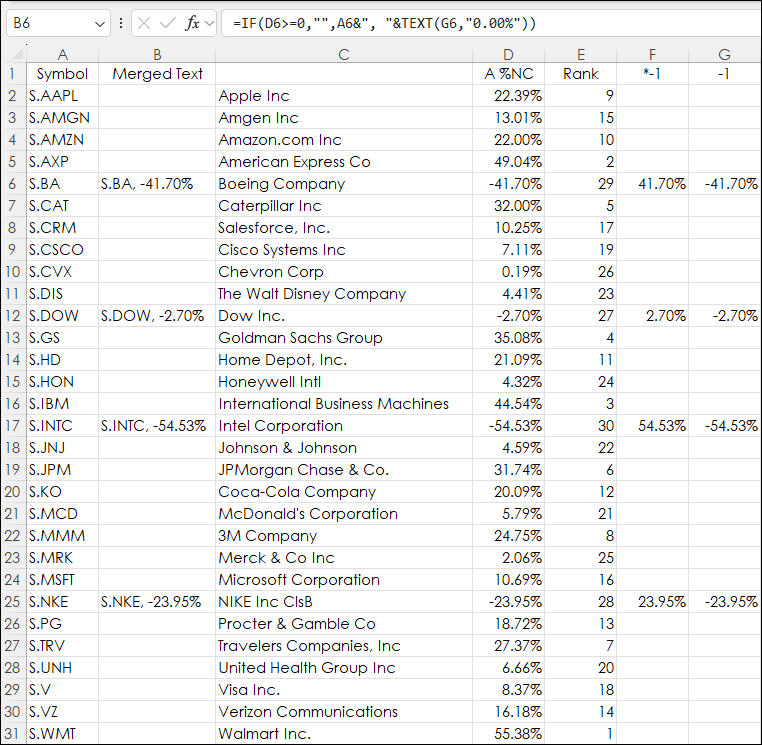
Above the columns are:
- Column A is the symbol
- Column B is merging the symbol with the text version of column G
- Column D is the annualized percent change
- Column E is the rank
- Column F the absolute value of the negative returns from column D
- Column G is the negative values
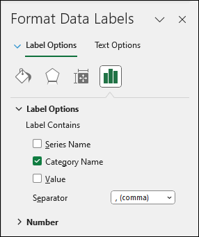
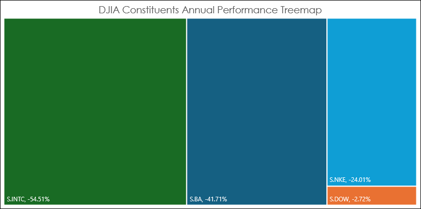
A new Treemap chart is created using column F for values. The labels for the boxes are from column B (symbol and percent net change merged). When adding the Labels select just "Category Name" and not "Value" for the labels.
Below is the Treemap chart for the stocks with negative performance for the year.
The sample spreadsheet is the same as the one used for the images in this post.
Requirements: CQG Integrated Client or QTrader, and Excel 2016 (locally installed, not in the Cloud) or more recent.
