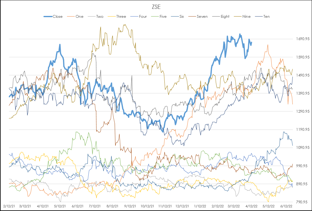
CQG offers the Seasonal Study for comparing the current market price action to the previous 10 individual years as line charts overlaid on the daily bar chart as shown below. In addition, the… more
Workspaces
Microsoft Excel spreadsheets have functionality to format cells based on conditions. This feature is also referred to as data visualization. This post details two types of data visualizations… more
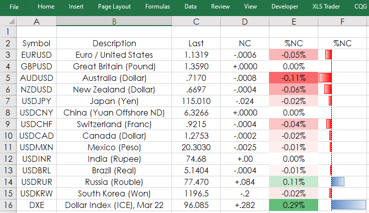
This post walks you through using Microsoft® Excel’s Indirect function and other Excel features to make usable Quote Dashboards. The provided sample Excel spreadsheet is unlocked.
Consider… more
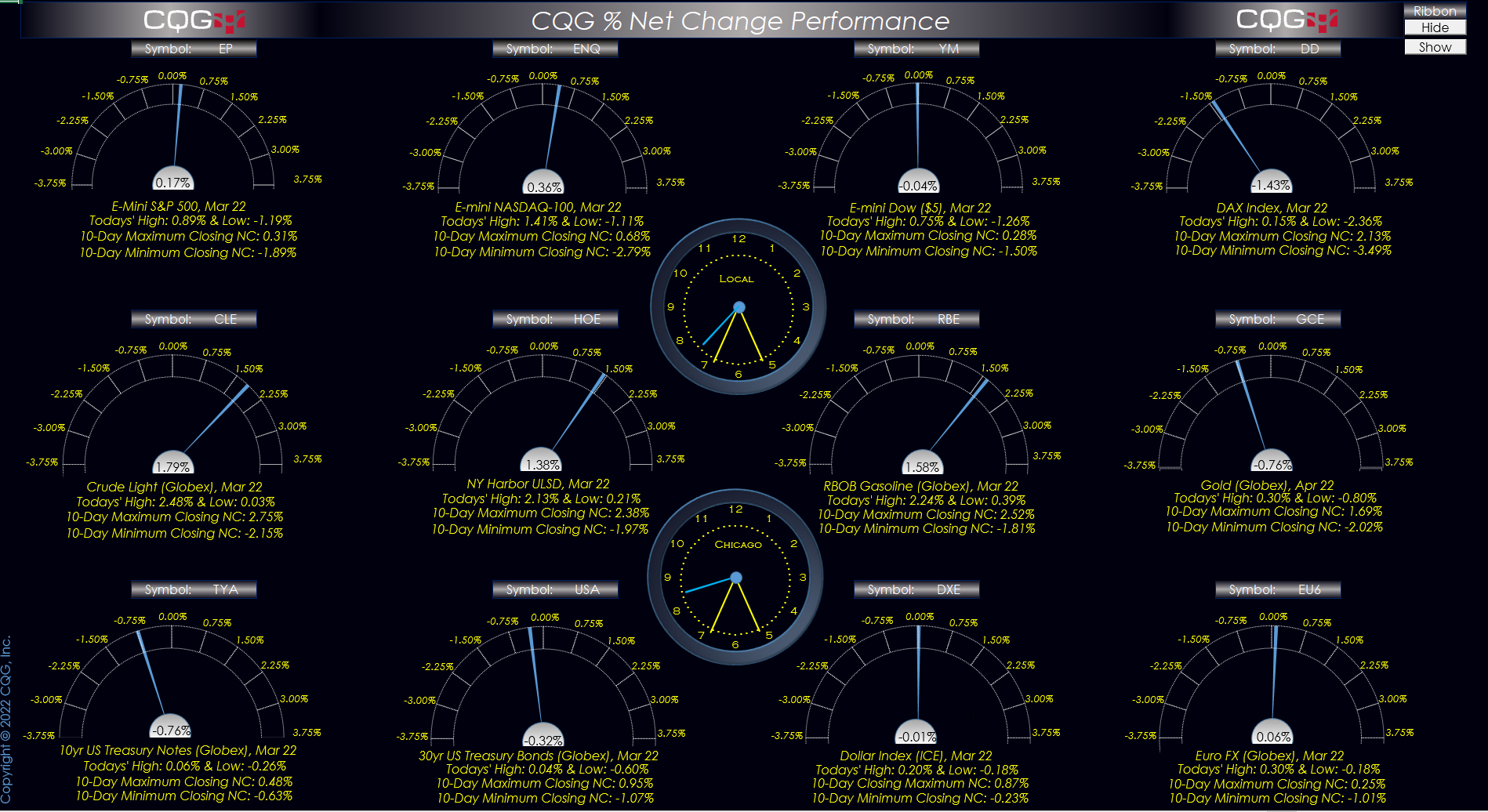
This Microsoft® Excel Dashboard pulls percent net change for the current session for twelve different markets.
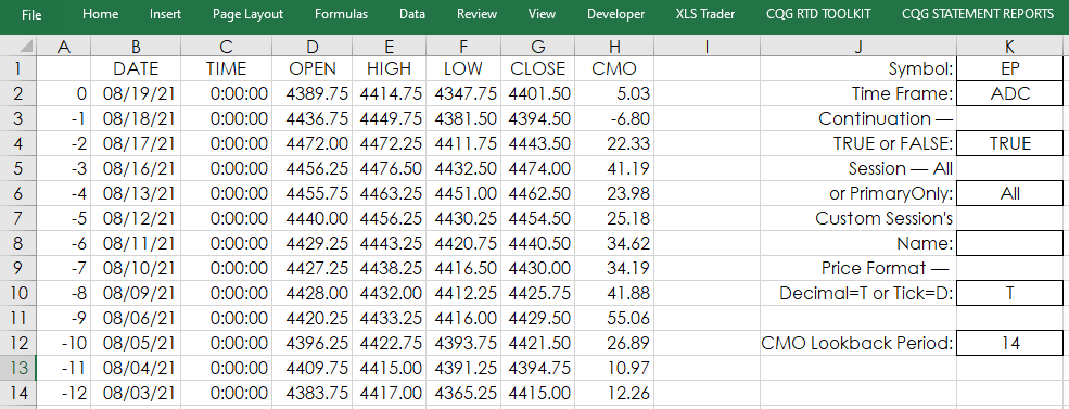
Next to “Symbol:” you can enter in your favorite symbol. Be sure and… more
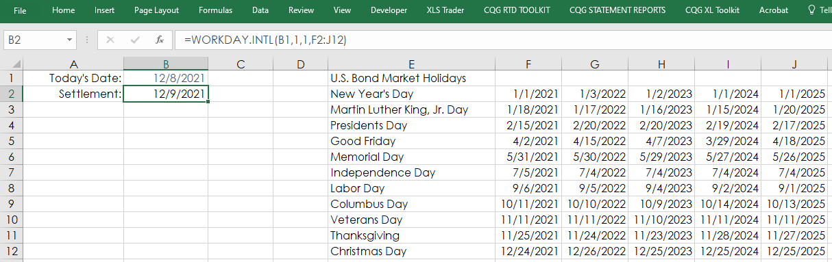
Fixed Income US Treasury traders may require the settlement date for calculating yields in Excel. Unfortunately, there is not an RTD function for pulling in the settlement date from CQG. However,… more
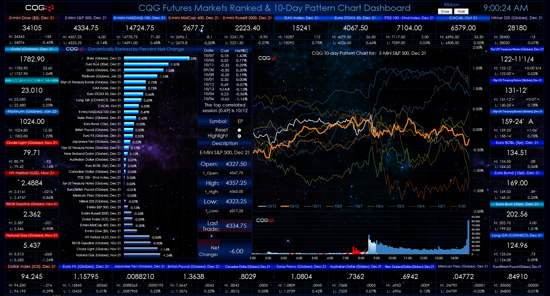
This Microsoft® Excel dashboard has a number of features. The primary feature is the 10-Day Pattern Chart. This chart displays the percent net change on a 5-minute basis for today (the white line… more
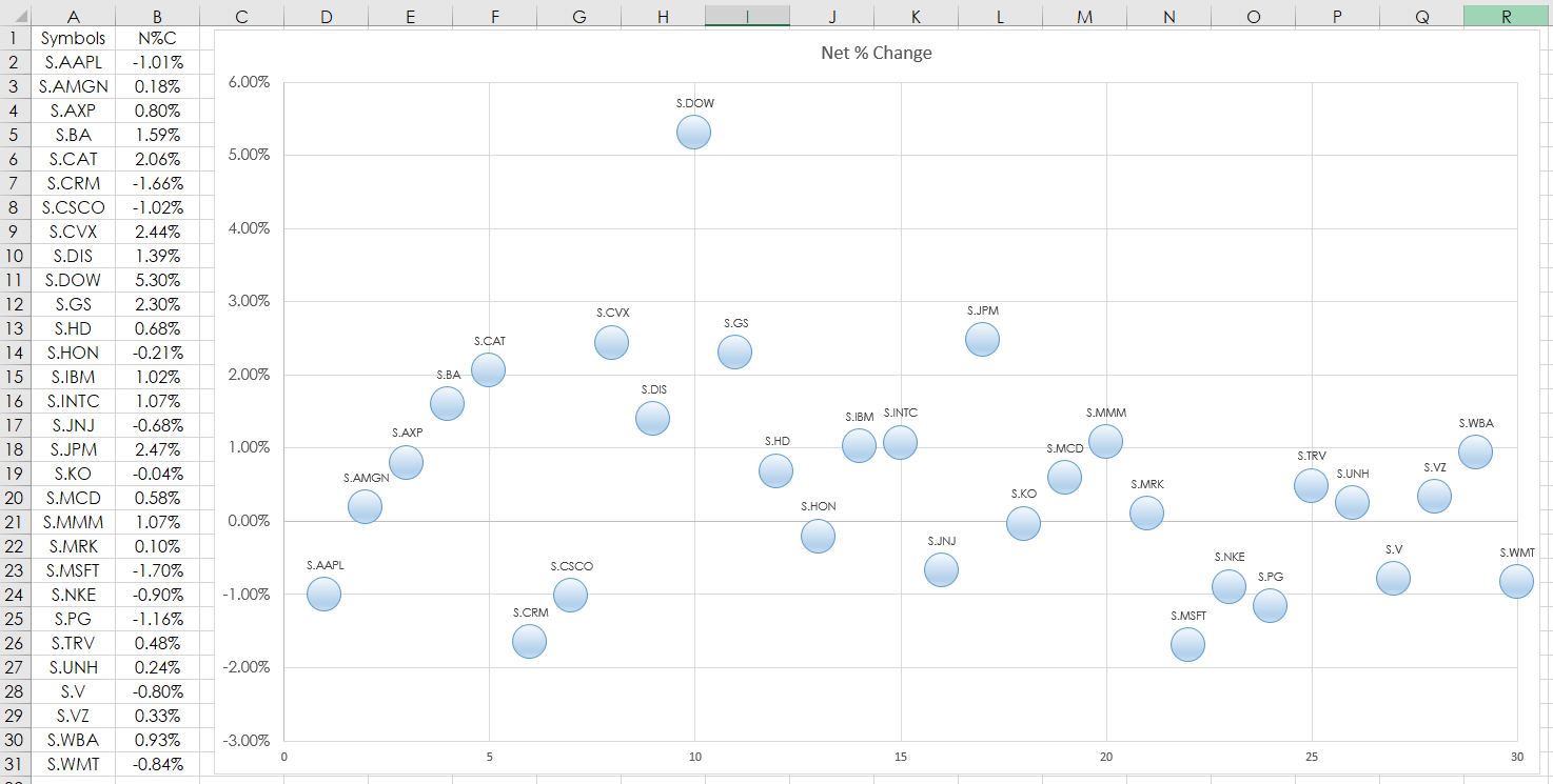
This post details using the Microsoft® Excel “Scatter Plot” Chart to track market performance. In this example, RTD formulas are used to pull in the percent net change of the 30 stocks that are in… more
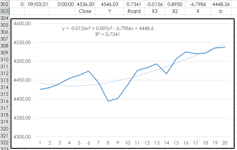
This article walks you through using Microsoft® Excel’s LINEST function to determine the three coefficients and y-intercept of a 3rd order polynomial function over the past 20 bars of closing… more
This post builds upon CQG Product Specialist Helmut Mueller's post titled “Most Wanted Seven Studies Plus a Bonus Trading System.” His post provides a PAC with the following studies:
Chande… more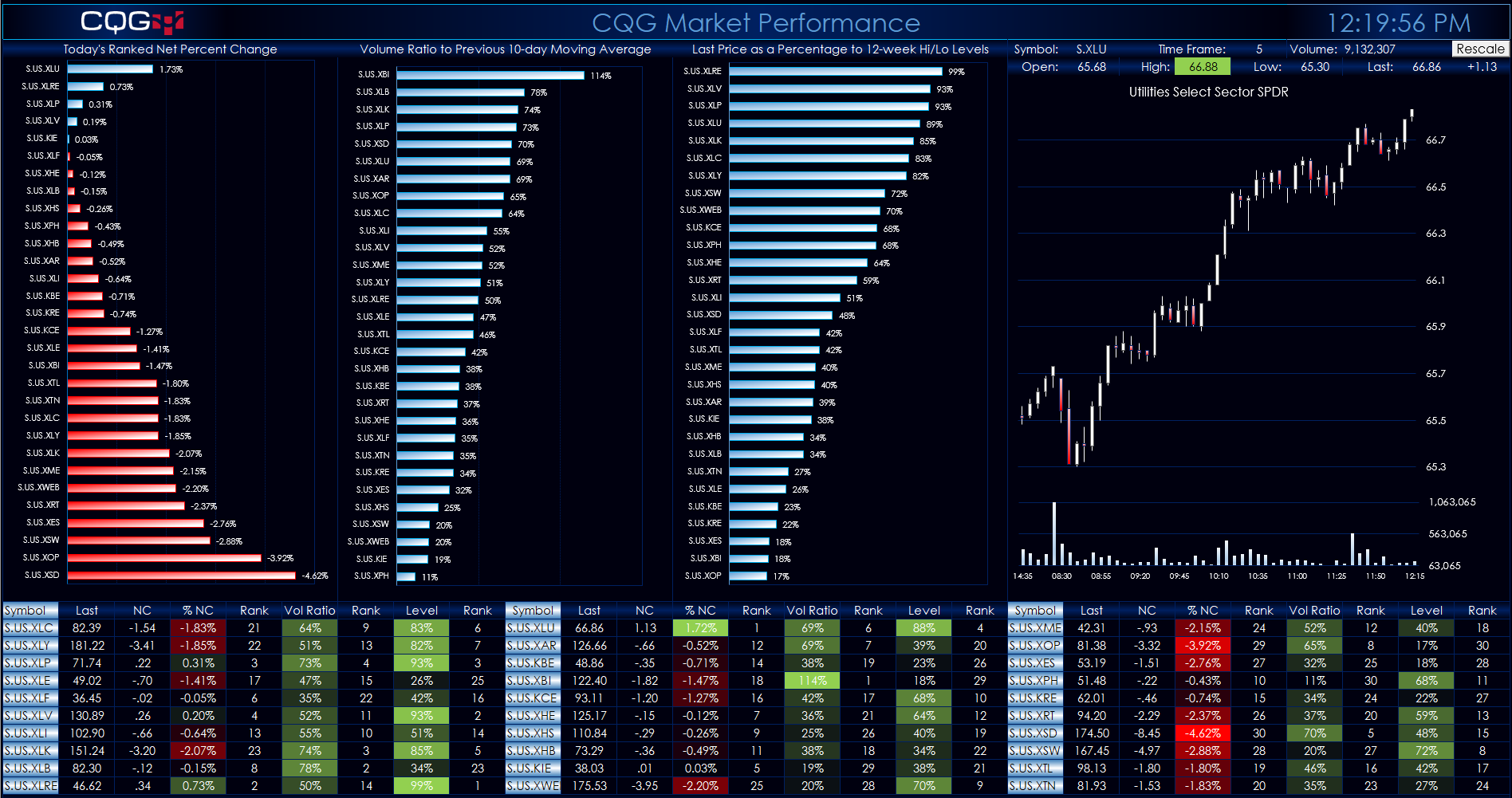
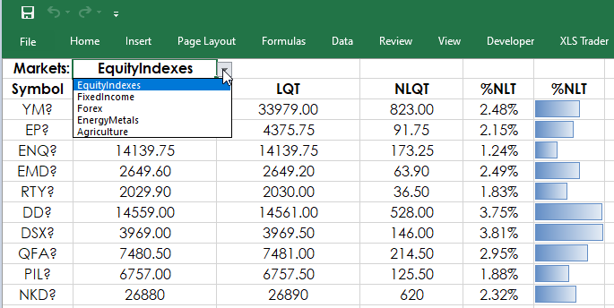
This Microsoft® Excel Dashboard comes frontloaded with 30 Sector and Industry symbols. However, you can enter in whatever symbols you like using the Symbols tab. The long description of the symbol… more