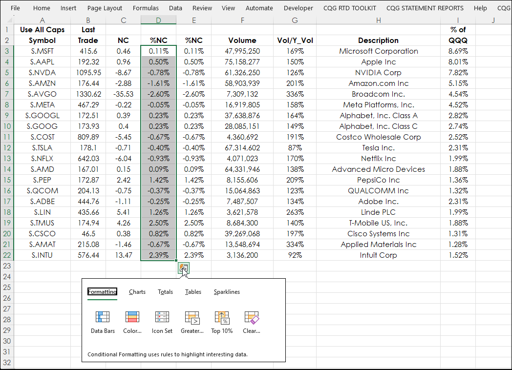
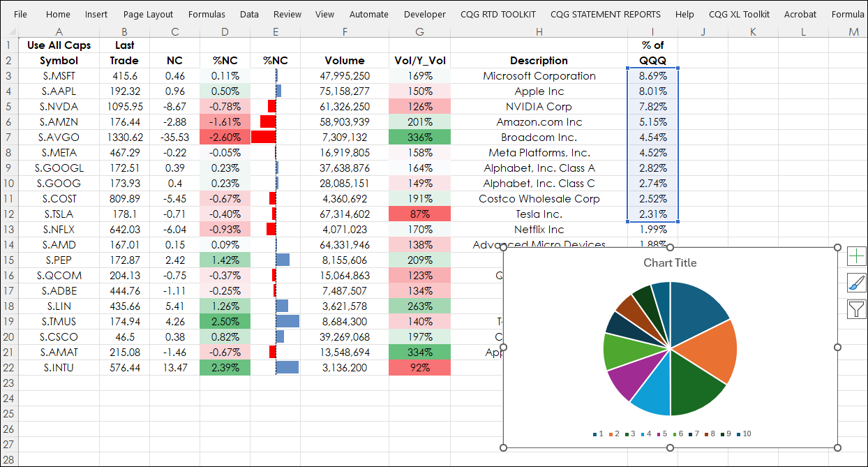
This post introduces using Excel's Quick Analysis Tool. First, a walkthrough of a typical application of one of Excel's data visualization features (heatmapping). In the image below heatmapping highlights using color the best and worst perfuming top 20 stocks by weighing in the Nasdaq 100 index.
Heatmapping is very useful because the top and bottom performing stocks are highlighted by color and thereby alleviates the viewer from having to do mental math to make the determinations.
To apply heatmapping to cells D3 through D22, which are the current percentage net changes, they are selected. Next, on the Excel ribbon select Home/Conditional Formatting/Color Scales.
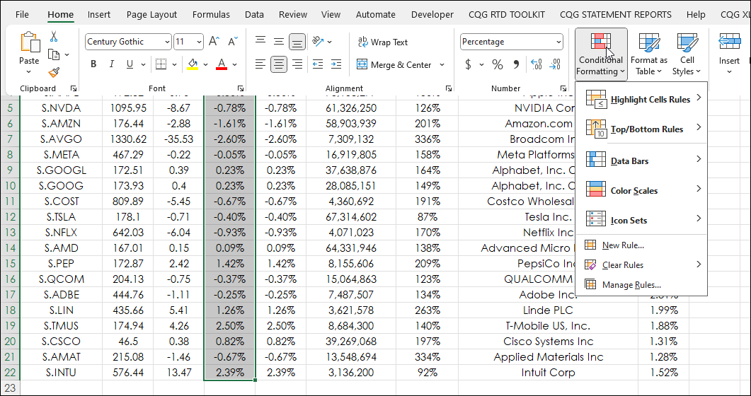
Next, select the preferred choice for the colors for the heatmapping.
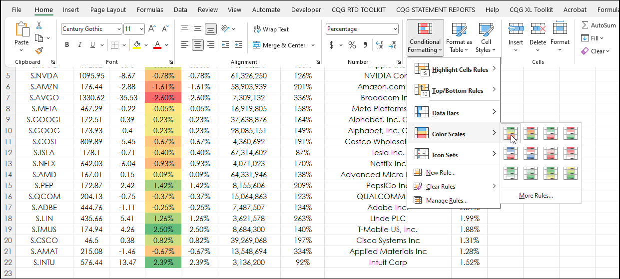
Now, the heatmapping colors are applied to the selected cells.
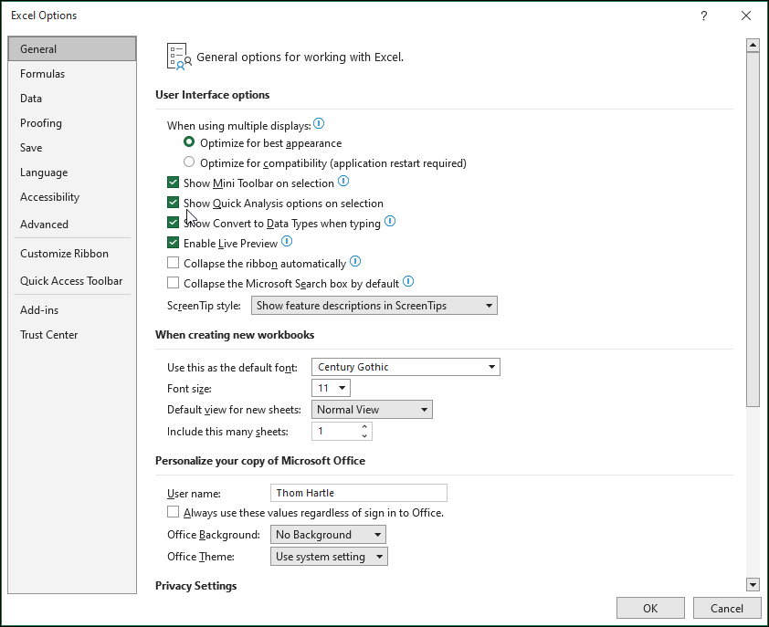
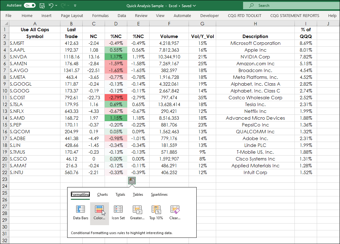
This process can be reduced to just one step using Excel's Quick Analysis Tool. First, make sure Excel Quick Analysis Tool (introduced in Excel 2013) is turned on. In Excel go to File/Options/General and check the Show Quick Analysis...
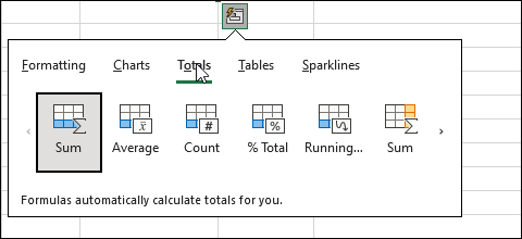
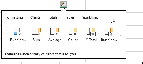
Now, when the cells are selected the Quick Analysis Tool icon appears when the mouse is near the bottom right corner. The choices are Formatting, Charts, Totals, Tables and Sparklines.
Under Formatting the choices are:
- Data Bars
- Color (heatmapping)
- Icon Set
- Greater Than
- Top 10%
- Clear
This feature avoids accessing the Excel Ribbon and the various menus for applying data visualization functionality to selected cells.
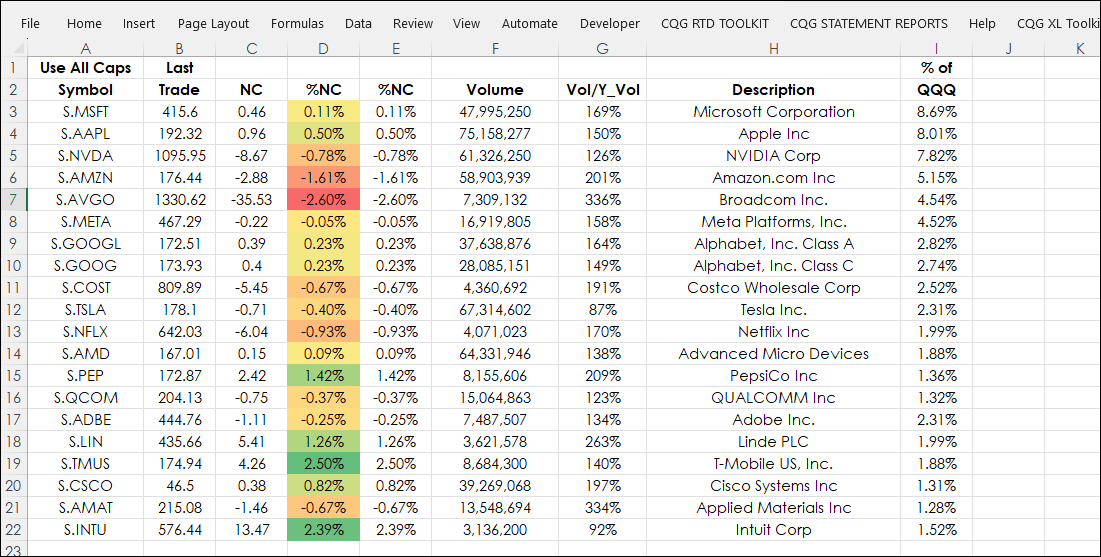
Select Color and the heatmapping is applied. There are two Percent Net Change columns, the second one has the Data Bars applied.
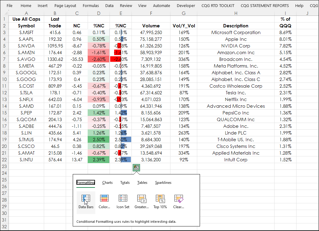
One issue is that to modify the data visualization features, such as only "show the Data Bars" and not the value requires accessing the Excel Ribbon and selecting the Conditions tab to access the menus. Go to Home/Conditional Formatting/Manage Rules/Edit Rules.
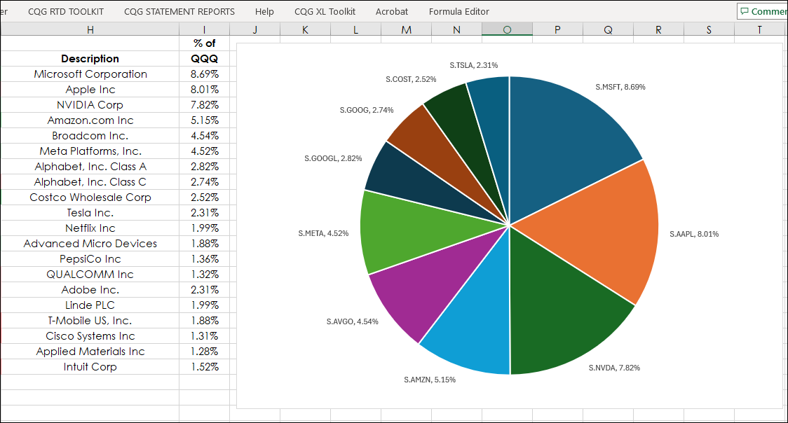
The second choice on the Quick Analysis Tool is Charts. For example, column I has the percentage the individual stocks consist of as constituents of the NASDAQ 100 (Symbol: QQQ). Select the first ten, then place the mouse near the bottom right to launch the Quick Analysis Tool icon and select Charts and navigate to the Pie chart.
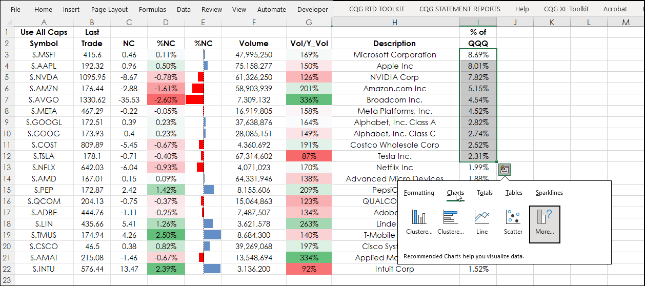
Once the Pie chart choice is selected the Pie chart appears in the Excel spreadsheet.
The Pie chart will need formatting. This post provides details for formatting a Pie Chart as shown in the next image.
The Totals tab has five different functions for either rows or columns.
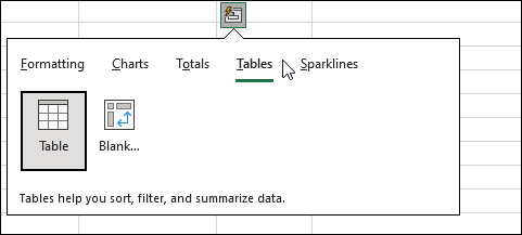
The Tables tab has two different functions.
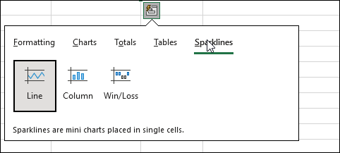
That last tab, Sparklines, offers three chart types.
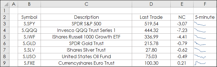
Sparklines charts are useful for offering a quick view of a market's performance in a single cell. This post provides details for working with Sparklines. The next image is from the downloadable Excel sample from the post.
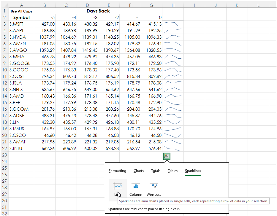
The Quick Analysis Tool Sparklines requires the data to be in rows. Cells B3 to G22 were selected and then Sparklines and the Sparklines spilled into column H.
Excel's Quick Analysis Tool can speed up workflow because many Excel features are accessed by simply selecting the cells and moving the mouse to the bottom right of the area selected to display the Quick Analysis Tool and not having to navigate the Excel Ribbon.
Requires CQG Integrated Client or CQG QTrader, and Excel 2013 or higher. Excel has to be installed on the local computer, not in the cloud.