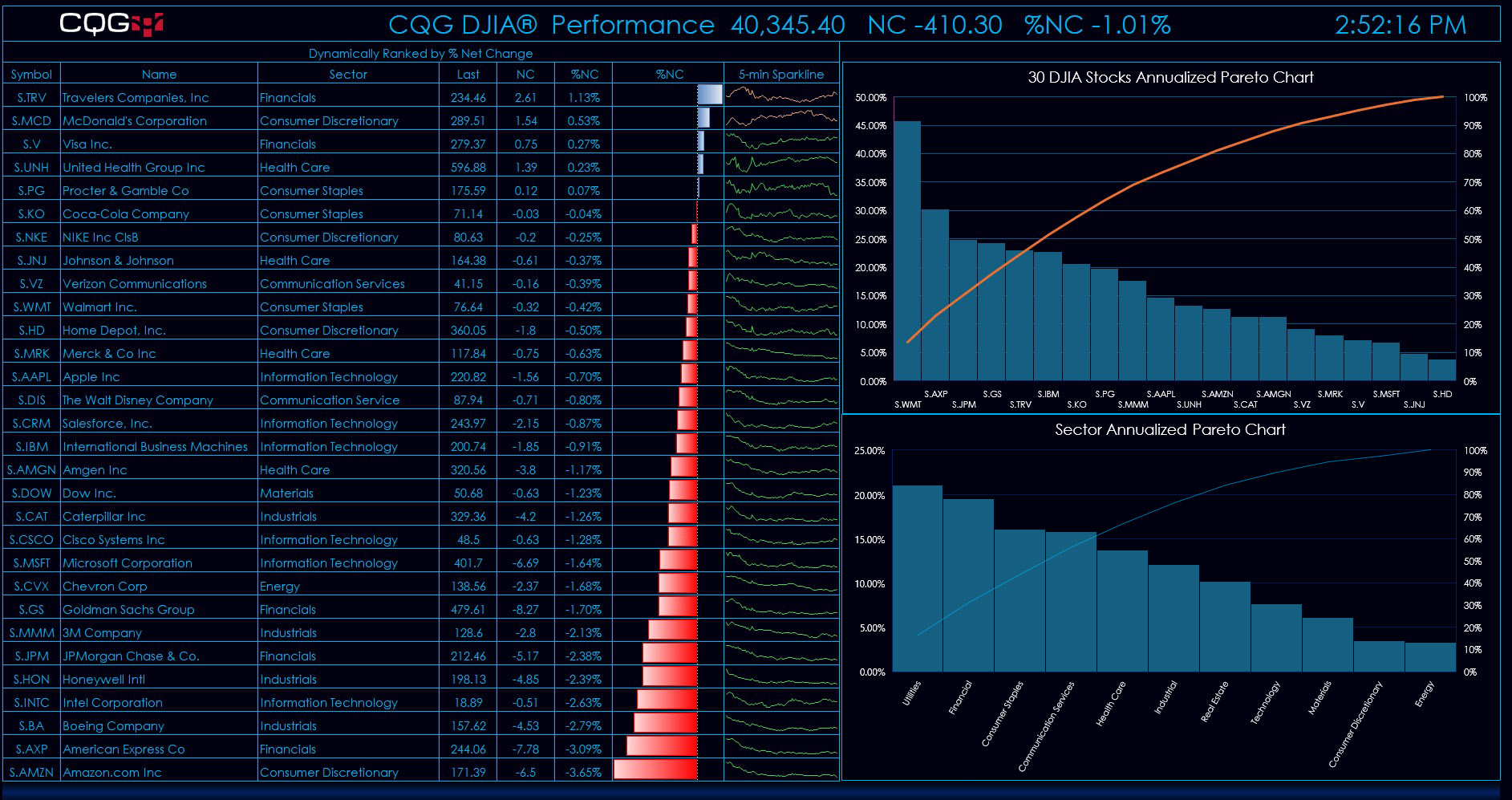
This Excel 365 Dashboard tracks the daily individual performance of the stocks making up the DJIA.
The main display details the symbol, name of the company, the sector the company is listed in, the last trade, the net change, the percentage net change, and a five-minute close sparkline chart.
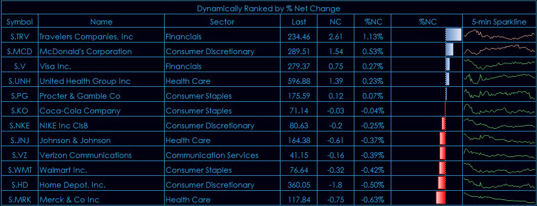
This display is dynamically ranking throughout the trading session in the background using Excel's SORT function.
During the trading session the best performing stocks move to the top of the display and the worst performers move to the bottom.
The five-minute close sparkline charts for each company build during the session. These sparkline charts offer an intraday view of the price action.
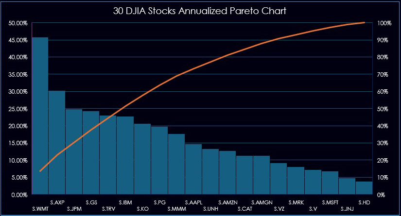
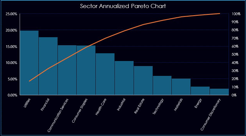
Two Pareto style charts are presented. A Pareto chart is a histogram chart displaying columns sorted in a descending order and a line representing the cumulative total percentage. Only positive histogram bars are displayed.
The first displays the current annualized performance of the 30 stocks from the DJIA index. As of this writing Walmart (WMT) is up over 45% for the year.
The second is the Sector annualized performance of the sectors. As of this writing, the Utilities sector is the best performing sector.
Here is the full dashboard.
Requirements: CQG Integrated Client or QTrader, and Excel 365 (locally installed, not in the Cloud) or more recent.