This post "Top Ten Performing ETFs for the Last Ten Years" listed the top performing ETFs since January 2015.
The top performer was VanEck Semiconductor ETF, symbol: SMH.
The VanEck… more
This post "Top Ten Performing ETFs for the Last Ten Years" listed the top performing ETFs since January 2015.
The top performer was VanEck Semiconductor ETF, symbol: SMH.
The VanEck… more
This post "Top Ten Performing ETFs for the Last Ten Years" listed the top performing ETFs since January 2015.
The top performer was VanEck Semiconductor ETF, symbol: SMH.
The VanEck… more
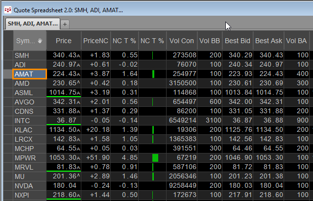
This post builds upon the previous post: Excel 365 TRIMRANGE Function.
That post detailed how to build a quote display using the TRIMRANGE function to automatically manage working with… more
Microsoft Excel 365 offers the TRIMRANGE function which excludes all empty rows and/or columns from the outer edges of a range or array. This post details how this function is useful for designing… more
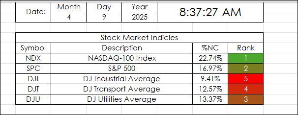
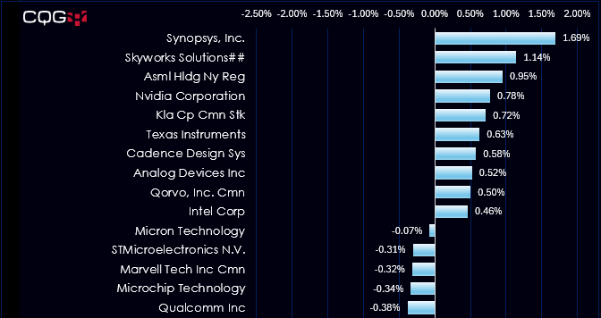
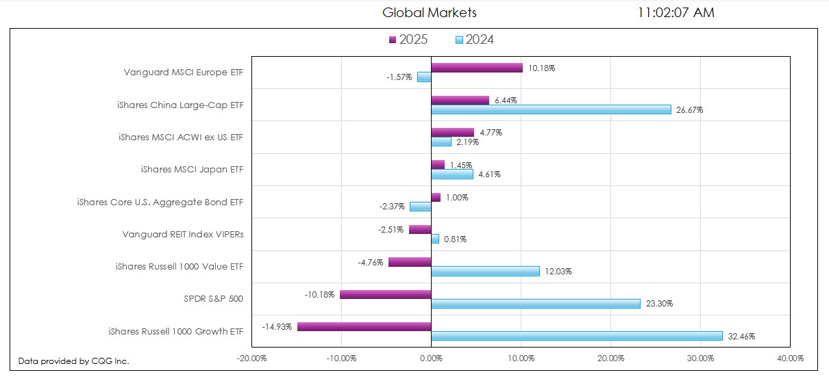
This Excel Dashboard uses RTD Calls to pull in the Net Percent Change of a collection of markets by a particular date.
For example, April 9, 2025:
"Markets News, April 9, 2025: Dow… more
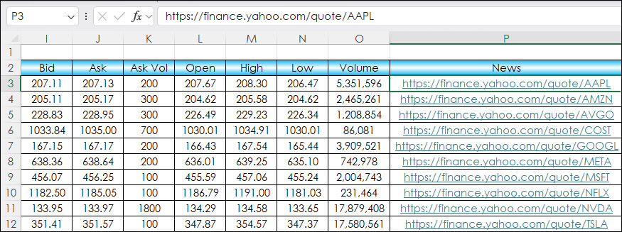
This post details adding HTML News Links to an Excel dashboard for monitoring equities and ETFs.
The news source is Finance.Yahoo.com. An example link for Microsoft is https://finance.yahoo.… more
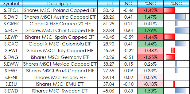
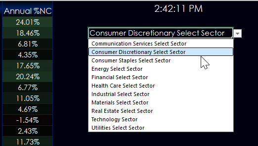
This post details an Excel dashboard tracking Country Equity ETFs performance. The dashboard ranks and sorts the Country ETFs traded using the NYSE American enablement. Fifty-one ETFs are tracked… more
This macro-enabled Microsoft Excel® spreadsheet tracks the holdings of the iShares Russell 1000 Growth ETF (symbol: IWF). The iShares Russell 1000 Growth ETF seeks to track the investment results… more
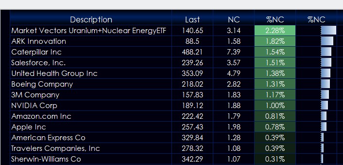
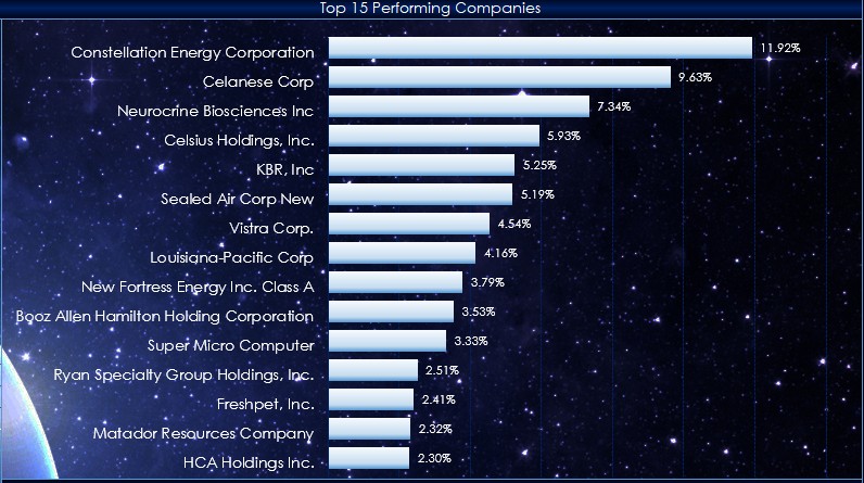
This post details the downloadable Excel Market Performance Dashboard's features and functions. The dashboard has seven tabs (the first is data and the other tabs display a chart and a table of… more
This macro-enabled Microsoft Excel® spreadsheet tracks the holdings of the iShares Core S&P U.S. Value ETF (symbol: IUSV). The iShares Core S&P U.S. Value ETF seeks to track the investment… more