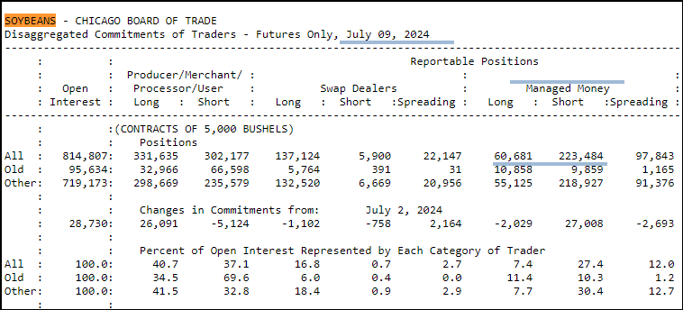
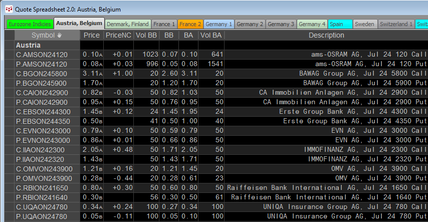
Tracking and analyzing cash market data is more difficult because most cash market data is a single print for the day of the report, that is there is no open, high, low or close, just the close.… more
Workspaces
The Excel 365 Filter function is a member of the Dynamic Arrays group. The function is useful for sorting through a large table of data.
The function is:
=FILTER(Array, Include, [If Empty… more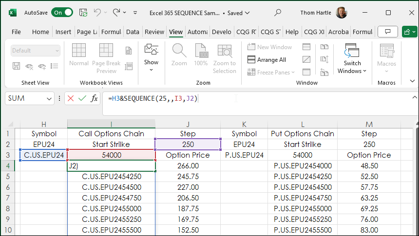
Excel 365 SQUENCE function populates a column or row with sequential integers, such as 1,2,3,4, etc.
The function has four parameters:
SEQUENCE(rows, [columns], [start], [step])
… more
This post, which includes a downloadable Excel sample at the bottom of the post, describes how to use Excel's XMATCH function to search a large table. The table used consists of the constituents… more
Introduction
Cboe Europe Derivatives (CEDX) is a European derivatives marketplace which enables participants to access equity derivatives markets for quotes and trade execution.
CEDX offers a… more
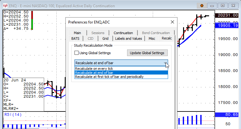
CQG IC and QTrader offer the ability to set recalculation rates for studies. In addition, RTD study formulas have a recalculation rate parameter.
In CQG select a chart and then Setup/Chart… more
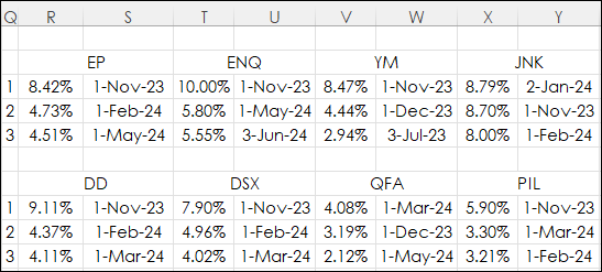
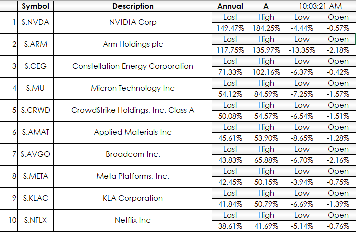
Excel 365 offers the LARGE and XLOOKUP functions. This post details using both for tracking market performance.
The image below is a table from Excel where the data presented are percent net… more
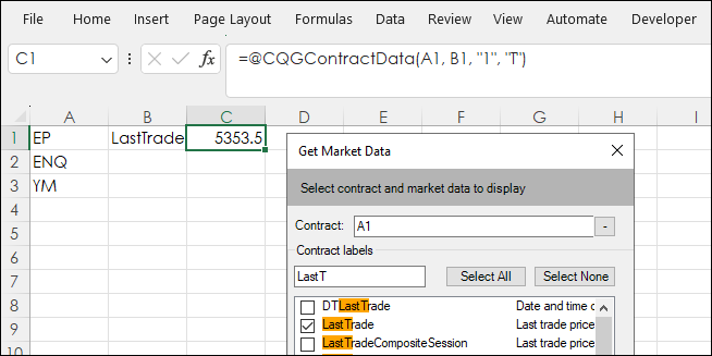
The RTD function displayed in the title of the post includes the "@" sign. If you use the CQG RTD Toolkit installed on the Excel Ribbon when either CQG IC or QTrader are installed to pull in "… more
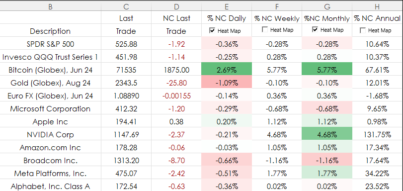
Heat mapping is a data visualization technique that highlights market performance using colors. Typically, bright green for the top performers and bright red for the weakest performers and… more
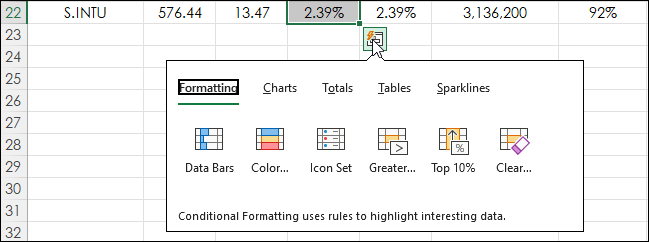
This post introduces using Excel's Quick Analysis Tool. First, a walkthrough of a typical application of one of Excel's data visualization features (heatmapping). In the image below heatmapping… more