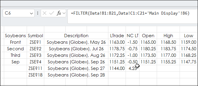
This Excel dashboard tracks agriculture markets and uses Excel's FILTER Function to pull the same month's contract data from each year.
The markets tracked are Soybeans, Soybean Meal,… more
This Excel dashboard tracks agriculture markets and uses Excel's FILTER Function to pull the same month's contract data from each year.
The markets tracked are Soybeans, Soybean Meal,… more
This post is similar to the recent post "Excel 365 GROUPBY and XLOOKUP".
That post introduced using the Excel function GROUPBY to arrange by sectors the stocks in the NASDAQ 100 and identify… more
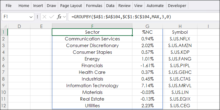
Excel's GROUPBY function offers the ability to create a summary of data. The data can be grouped, aggregated, sorted, and filtered based on the fields you specify.
The syntax of the GROUPBY… more
The Excel dashboard at the bottom of the post displays the stocks tracked in the NASDAQ 100 Index broken down by the 11 Global Industry Classification Standard (GICS) sectors.
The NASDAQ 100… more
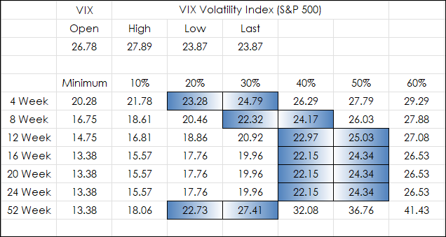
From the Google AI: "The VIX Index, or CBOE Volatility Index, is a real-time market indicator representing the market's 30-day expectation of forward-looking volatility for the S&P 500 Index.… more
This post details a Microsoft Excel dashboard that tracks the day's performance of the holdings of the Schwab U.S. Dividend Equity ETF (Symbol: SCHD)
From their website:
ObjectiveThe… more
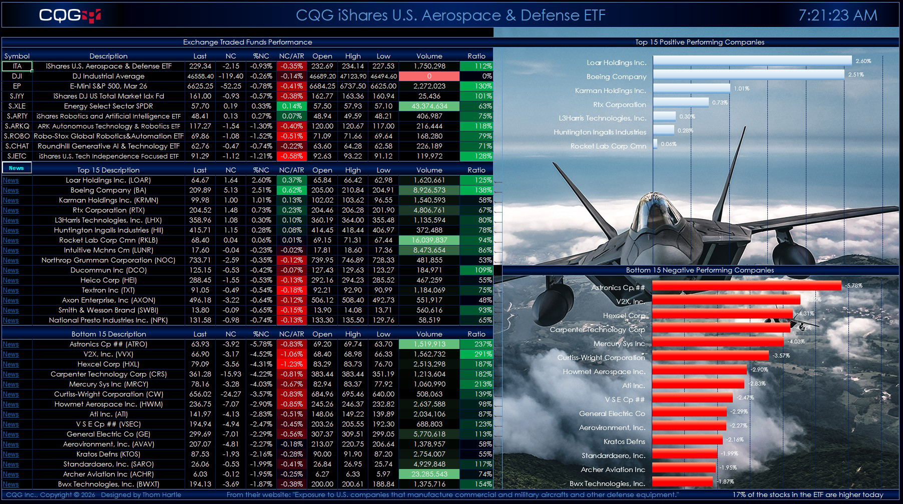
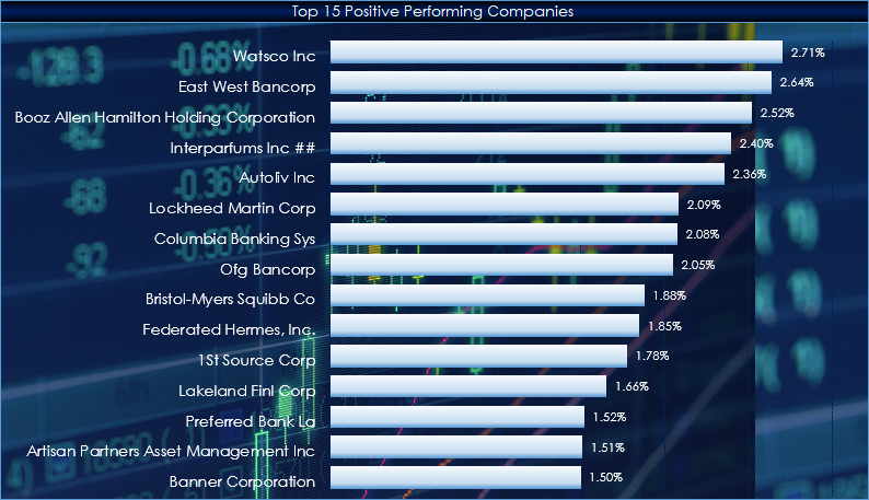
This post offers two Excel dashboards for tracking the holdings of the iShares U.S. Aerospace & Defense ETF (Symbol: ITA).
The iShares U.S. Aerospace & Defense ETF seeks to track the… more
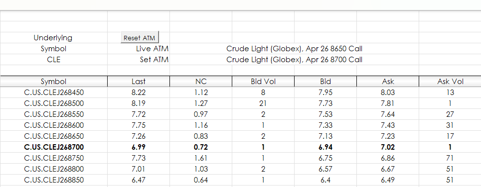
This macro-enabled Excel dashboard pulls in futures call and put options data for a specific underlying contract. There are two tabs: Call Data and Put Data.
Each tab has the following… more
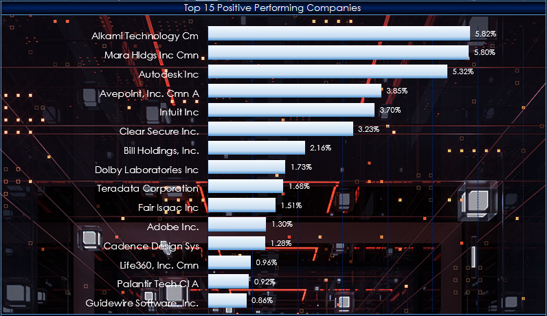
This post details a Microsoft Excel dashboard that tracks the day's performance of the holdings of the iShares Expanded Tech-Software Sector ETF (Symbol: IGV).
From the iShares website… more
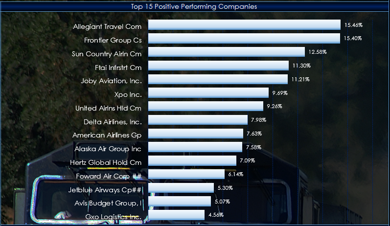
This post details a Microsoft Excel dashboard that tracks the day's performance of the holdings of the iShares Transportation Average ETF (Symbol: IYT).
The stock market media has been… more