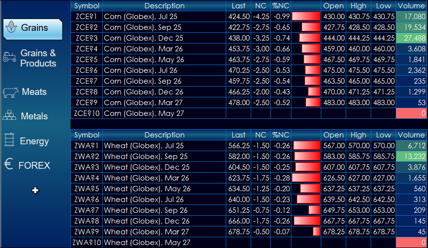
This dashboard provides market data for CME products. The dashboard uses a navigation bar instead of tabs.
The left-hand side provides market data for products. The right-hand side… more
This dashboard provides market data for CME products. The dashboard uses a navigation bar instead of tabs.
The left-hand side provides market data for products. The right-hand side… more
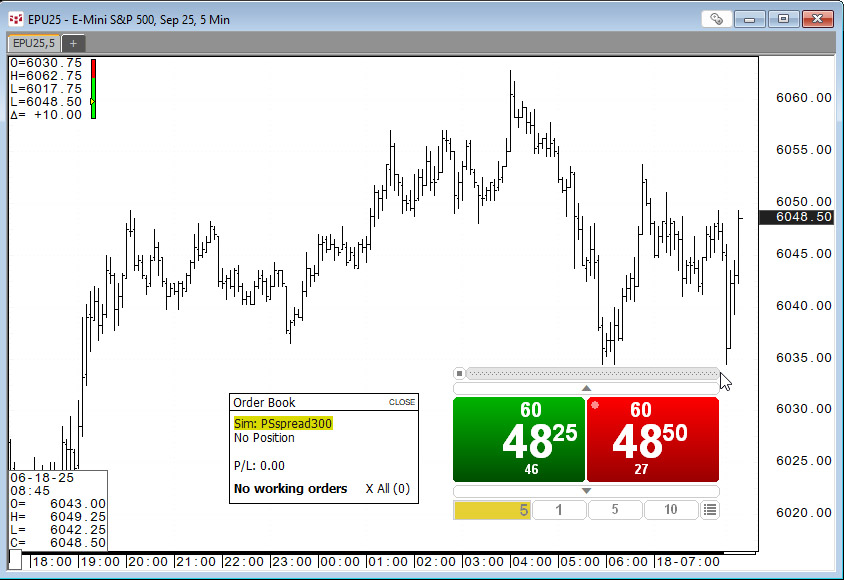
For those who trade based on the price action unfolding on a chart the appropriate trade routing interface is the SnapTrader 2, the topic of this post.
Below, the SnapTrader 2 (horizontal… more
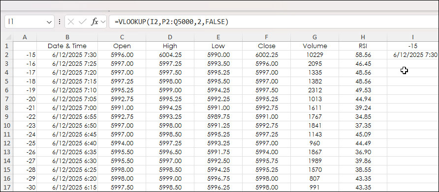
A typical historical Excel RTD dashboard pulls in market data using the bar index parameter. Below, the bar index is in column A. The most current bar is "0". The previous bar is "-1", etc.
… more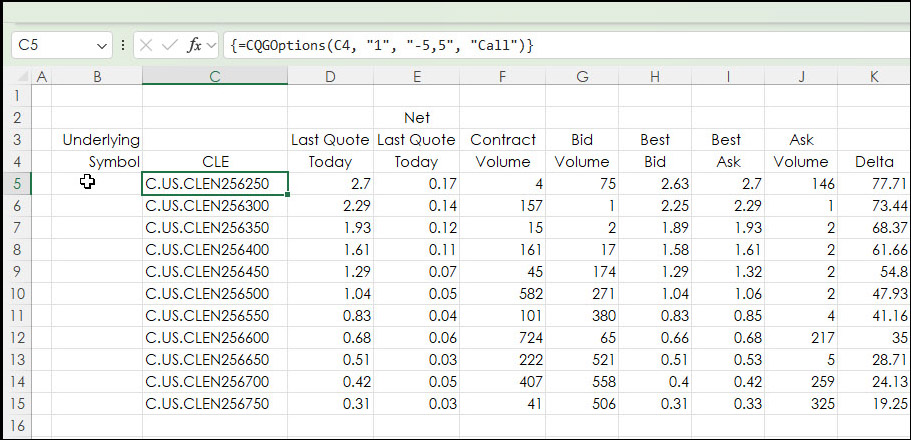
This post walks the reader through building option chains in Excel. The CQG RTD Toolkit offers this functionality, however, the same feature can be implemented using Excel's CONCATENATE function.… more
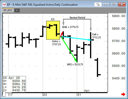
This post provides a guideline to reviewing the outcomes of a pattern recognition approach to the markets.
Two recent posts on Workspaces discussed CQG's Candlestick Formations Study.
… more
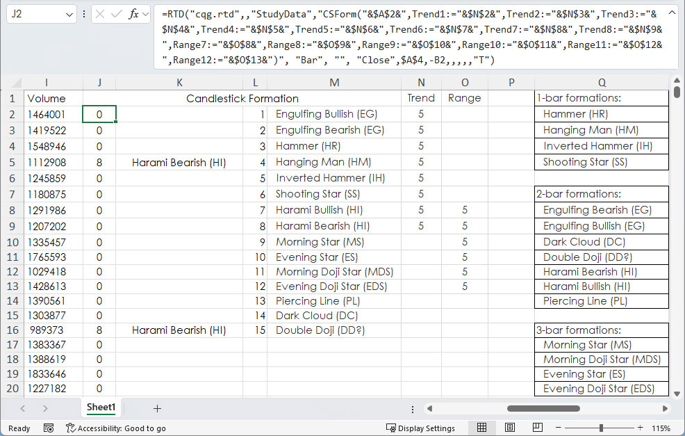
A recent post "CQG Primer: Candlesticks Formations Study" introduced this study available in CQG IC and QTrader. The study is a collection of fifteen conditions. The Candlestick formations appear… more
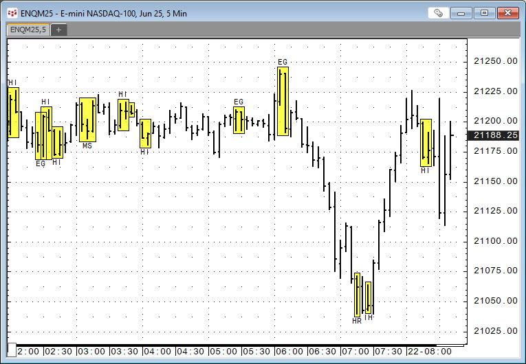
CQG IC and QTrader offer the Candlestick Formations study.
The Candlestick Formations study is a collection of conditions. Candlestick formations appear as overlays on the chart in the… more
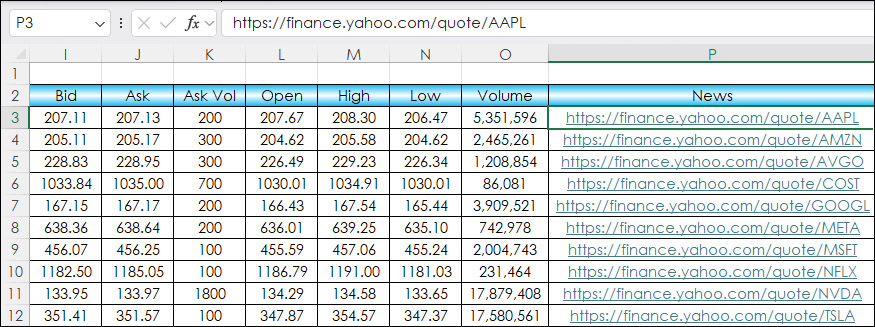
This post details adding HTML News Links to an Excel dashboard for monitoring equities and ETFs.
The news source is Finance.Yahoo.com. An example link for Microsoft is https://finance.yahoo.… more
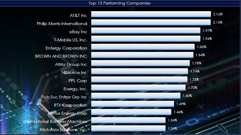
This macro-enabled Microsoft Excel® spreadsheet tracks the holdings of the Invesco S&P 500® Momentum ETF (SPMO). The ETF is based on the S&P 500 Momentum Index (Index).
Recently… more
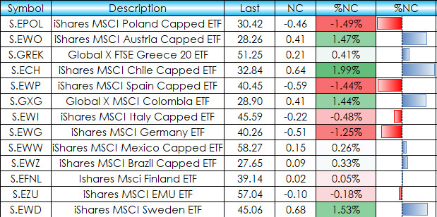
This post details an Excel dashboard tracking Country Equity ETFs performance. The dashboard ranks and sorts the Country ETFs traded using the NYSE American enablement. Fifty-one ETFs are tracked… more