This short article is not a huge programming exercise, it is mainly about a smart way to see seasonal behavior in an overlay chart. Here is the result we would like to have:
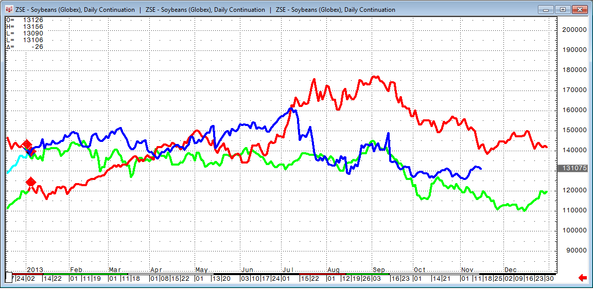
The blue line is the current soybeans contract and shows how it is trading today. The red line is the same contract (continuation chart), but shows how it traded in 2012 while the green line represents 2011.
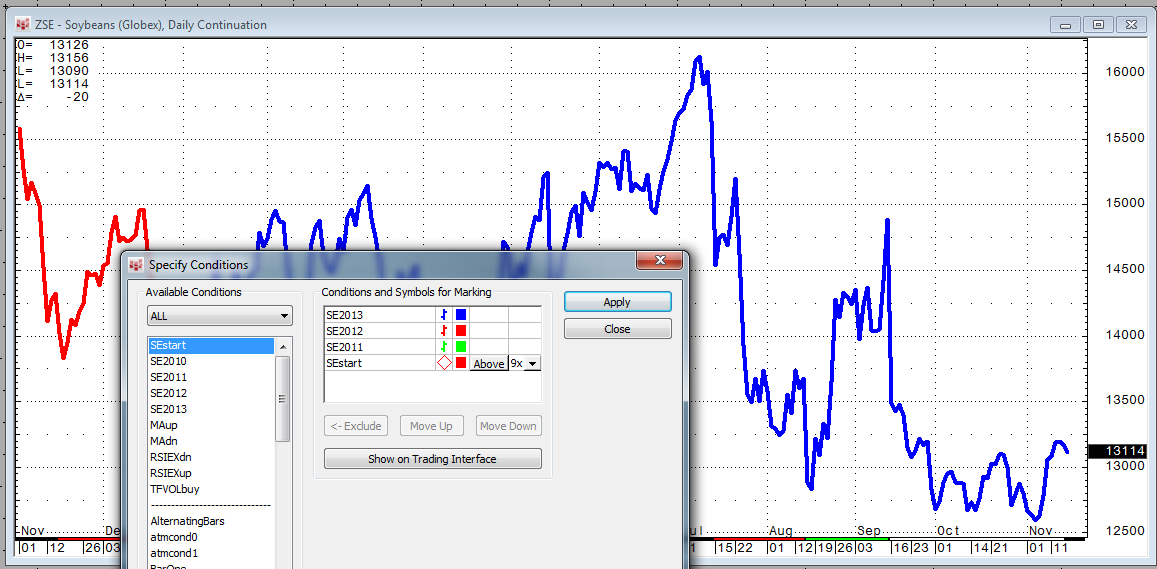
I use three simple conditions to color the line chart based on the year:
- Blue:
LocalYear(@) = 2013 - Red:
LocalYear(@) = 2012 - Green:
LocalYear(@) = 2011
Another condition gives me the first trading day of each year: LocalYear(@) > LocalYear(@)[-1]
As a starting point, I apply all four conditions to a normal line chart:
After this is done, I add the Chart Analog Overlay study two times. It overlays the same chart three times.
Now I hold the Ctrl key and move the chart to the right until the color change (red to green) matches the color change (red to blue) of the underlying charts.

I then bring the next chart to the foreground and move it to the right in the same way until the color change (black to green) is in line as well.
A bit of fine tuning is necessary to get them all exactly in line. After this is done, I bring each chart to the foreground and right-click on the scale to select Same Scale.

If you change to a different contract, for example QP for ICE Gasoil, only minor adjustment is needed to align everything again, in most cases.
