With our 2.0 release on mdemo.cqg.com, we've also added a volume comparison widget. You can access it by swiping on the chart that's attached to a quote board.
What is it and why is it helpful?
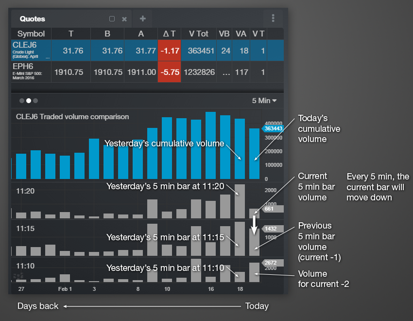
Dual-axis volume comparison
Beyond a standard volume histogram, this gives you insight as to how the market is behaving compared to previous days in two ways:
- Compared to the same time period in previous days
- Compared to previous time periods today and in previous days
This dual-axis comparison enables you to see how the market is evolving in a more granular way rather than traditional volume histograms on a chart.
The image here breaks down the elements:
It is available today on http://mdemo.cqg.com, and we'll deploy it to m.cqg.com next week.
Thanks to Thom Hartle, who's volume comparison dashboard was the basis for this. And thanks to the design, development, ops, and support teams for making this happen. If you have any questions or issues, please e-mail us at mobility@cqg.com.
Thanks,
Marcus