The Ark Innovation ETF (symbol: ARKK) goal is to deliver long-term capital appreciation with low correlation to traditional investment strategies. They invest in the leaders, enablers and… more
Excel/RTD
The Invesco QQQ is an exchange-traded fund based on the Nasdaq-100 Index®. The Index includes 100 of the largest domestic and international nonfinancial companies listed on the Nasdaq Stock Market… more

A recent YouTube post from the All-In Podcast interviewed NVDIA's Jensen Huang, Advanced Micro Devices' Lisa Su, MP Materials' Jim Litinsky, and Crusoe's Chase Lochmiller.
… more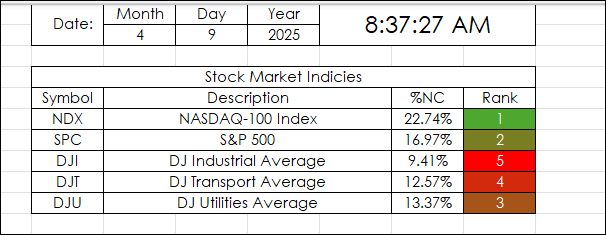
This Excel Dashboard uses RTD Calls to pull in the Net Percent Change of a collection of markets by a particular date.
For example, April 9, 2025:
"Markets News, April 9, 2025: Dow… more
This post presents an Excel dashboard for tracking the constituents of the S&P 500 SPYDR ETF.
The S&P 500 is one of the most cited U.S. stock market indices by the medial and… more
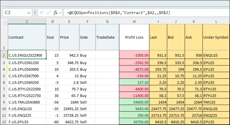
This spreadsheet built by CQG Product Specialist Jim Stavro uses RTD calls to pull in open futures and options positions as well as "Greeks" using RTD formulas.
To use the spreadsheet, CQG… more
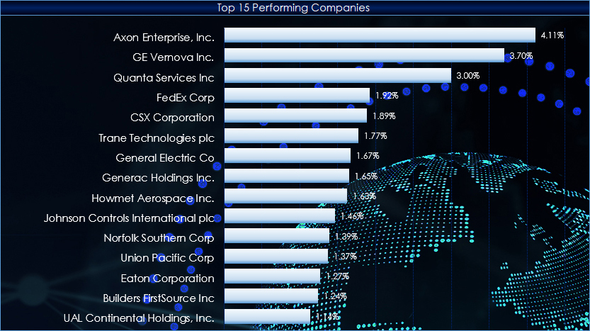
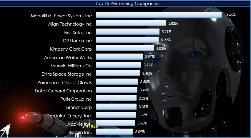
This post presents an Excel dashboard for tracking the constituents of the Industrial Select Sector SPDR® Fund. So far, during 2025 the top performing sector is the Industrials Sector (up 17.63%)… more
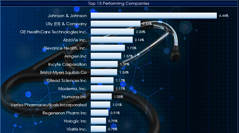
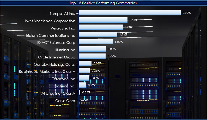
This macro-enabled Microsoft Excel® spreadsheet tracks the holdings of the Health Care Select Sector SPDR® (XLY). The ETF is based on the Health Care Select Sector Index.
There are 60 stocks… more
This function is available in the Add Study window and in the Formula Toolbox.
The function measures the strength and direction of the price movement of two symbols over a defined number of… more
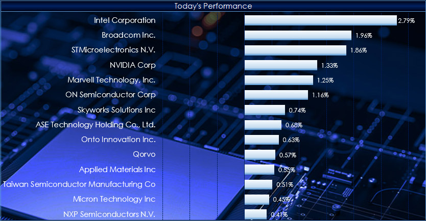
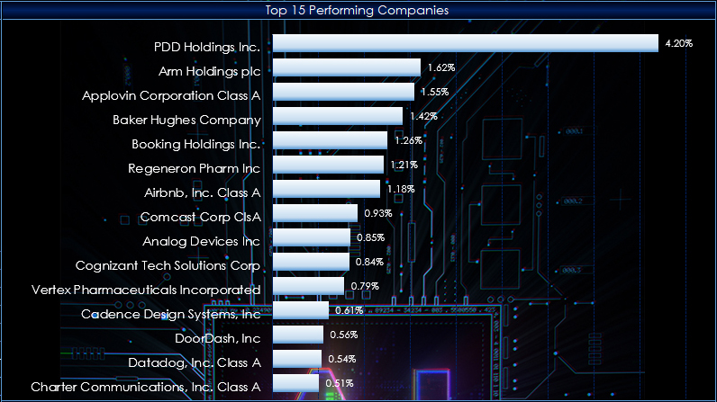
This macro-enabled Microsoft Excel® spreadsheet tracks the holdings of the iShares Semiconductor ETF (SOXX). The ETF tracks the investment results of an index composed of listed US equities in the… more