This post details a Microsoft Excel dashboard that tracks the day's performance of the holdings of the iShares Transportation Average ETF (Symbol: IYT).
The stock market media has been… more
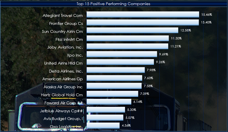
This post details a Microsoft Excel dashboard that tracks the day's performance of the holdings of the iShares Transportation Average ETF (Symbol: IYT).
The stock market media has been… more
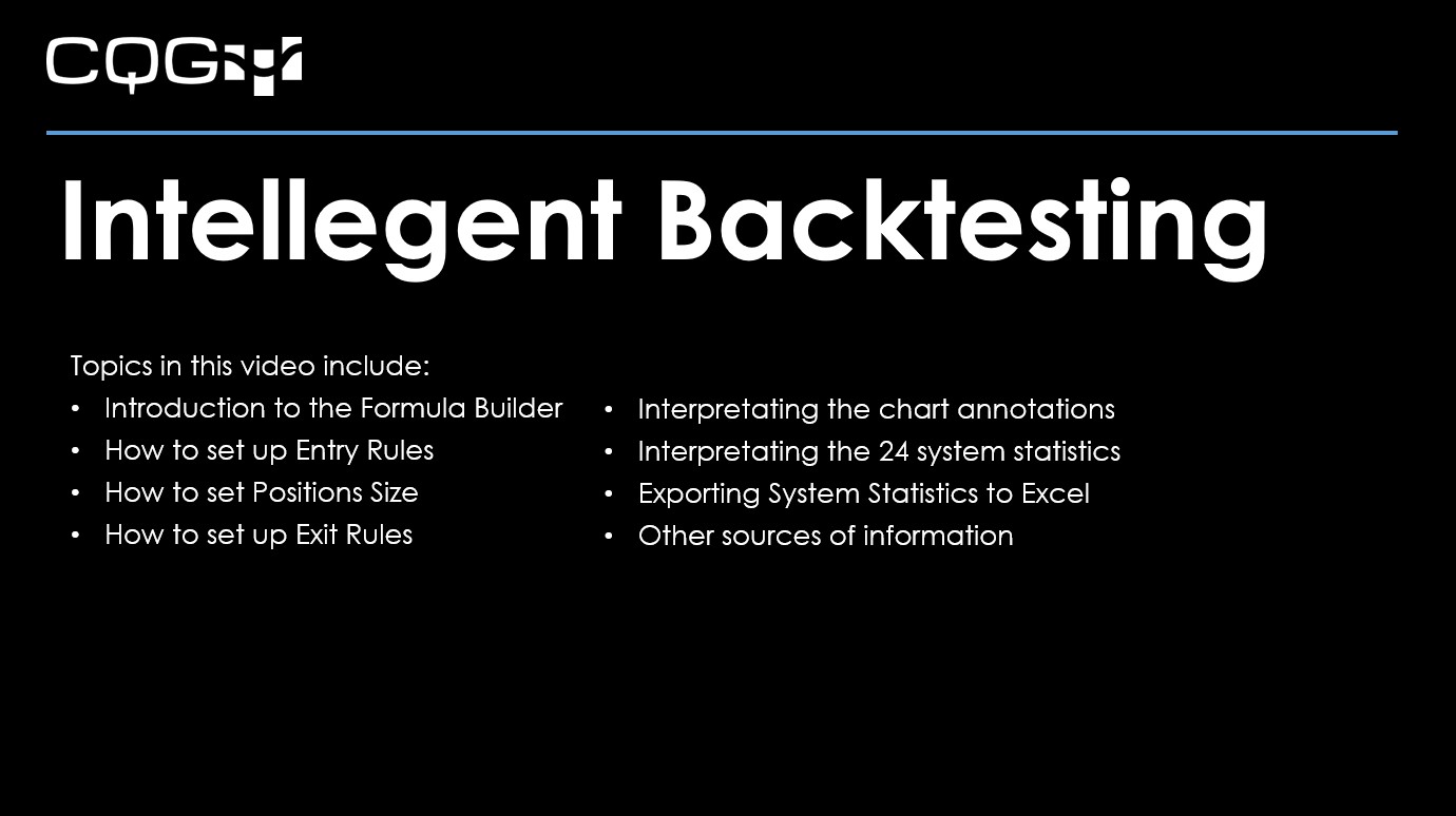
This video walks you through the basic steps to building your first trading system in CQG IC.
For best viewing, click "Watch on YouTube" and then full screen.
Topics in this video… more
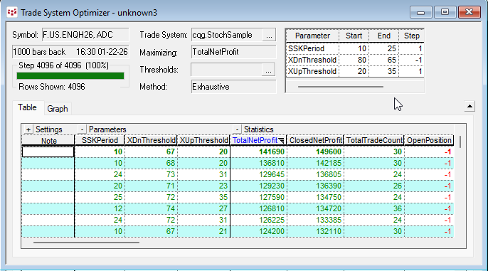
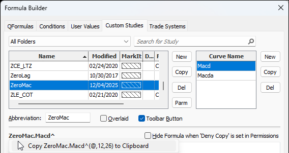
The CQG Trade System Optimizer (TSO) is a module that offers you a tool for testing different parameters of a trade systems and cataloging the results. All combinations of the parameters are… more
In Mr. Ehlers Book “Cybernetic Analysis for Stocks and Futures” the “Leading Indicator” was introduced. The goal of this study was to smooth the price action while not having the lag by the study… more
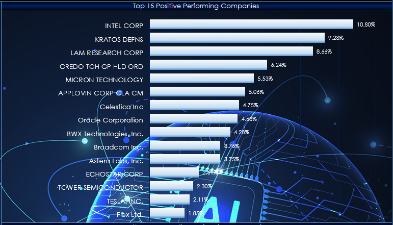
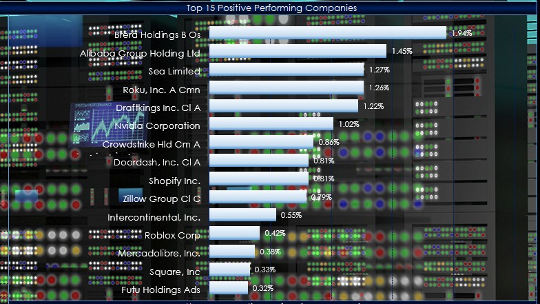
This post details a Microsoft Excel dashboard that tracks the day's performance of the holdings of the iShares A.I. Innovation and Tech Active ETF (Symbol: BAI).
From the iShares website as… more
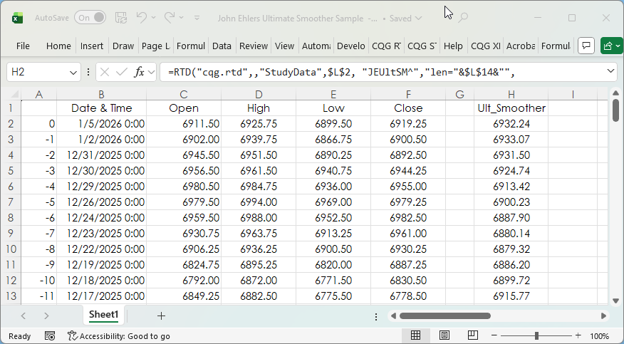
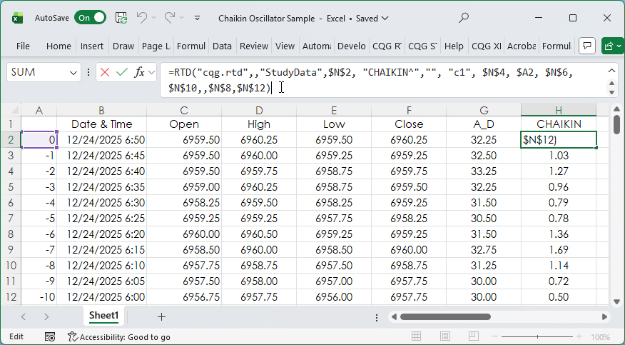
This post details the steps to pulling custom study values into Excel using RTD formulas. First, an overview of RTD formulas and parameters.
When CQG IC or QTrader are installed, a DLL… more
The post CQG Primer: The Ultimate Smoother detailed a study developed by John Ehlers. You can find a detailed description of the Ultimate Smoother on the MESA Software website.
This post… more
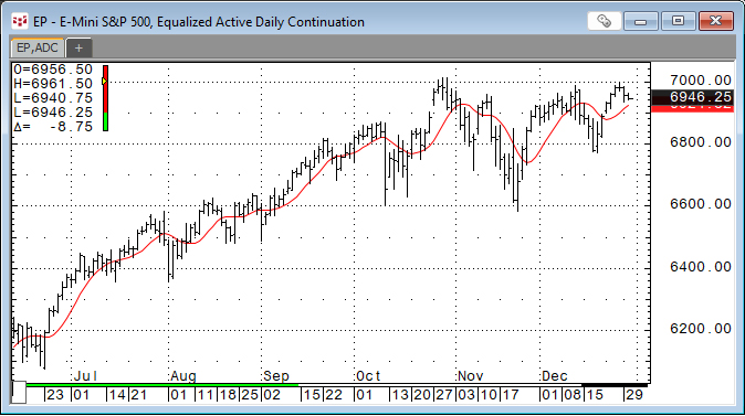
John Ehlers developed the Ultimate Smoother study. https://www.mesasoftware.com/TechnicalArticles.htm The study is a two-pole low-pass digital filter designed to smooth price data while… more
From the ARK website: "ARKF is an actively managed Exchange Traded Fund (ETF) that seeks long-term growth of capital. It seeks to achieve this investment objective by investing under normal… more
The Accumulation/Distribution Study and the Chaikin Oscillator were introduced in the post titled CQG Primer: The Chaikin Oscillator.
The Chaikin Oscillator is the difference between two… more